
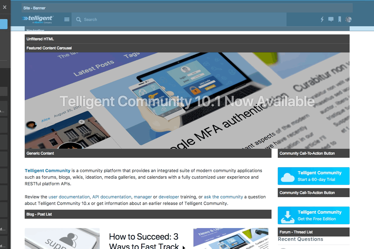
The look and feel of a community is fully customizable using drag and drop rearrangement to fully custom development and integration with external site and applications.
Themes
User interface customization is based on the concept of themes. Themes define the visual organization and styling for the community user experience. To learn more about the components and purposes of a theme, see What is a theme? What is a widget? Widget List
Basic Editing
Editing themes is primarily handled within the management panels. To access the theme options,
- Go to Manage > Manage Site Theme (or Group Theme or Blog Theme).
- The available options for editing the theme are then presented. To edit the default version of a theme, select the Manage Default Site Theme (or Group Theme or Blog Theme) from the list of theme management options (note that the site theme does not have a default implementation).
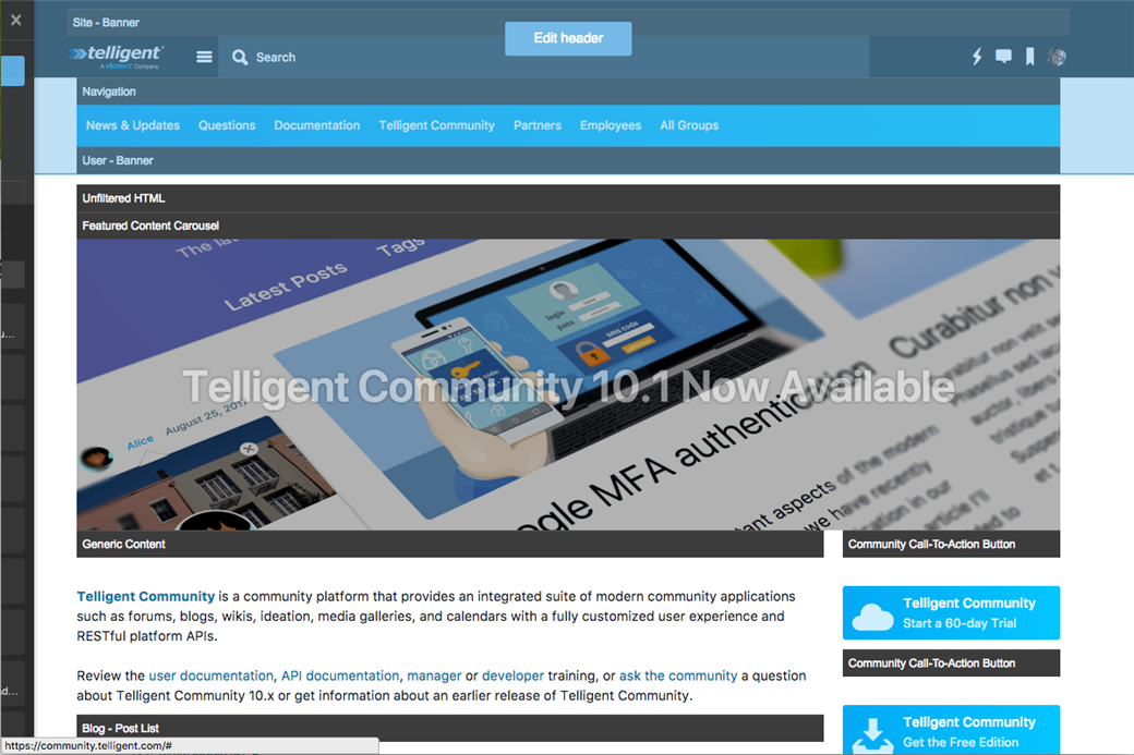
- Select Edit this Page.
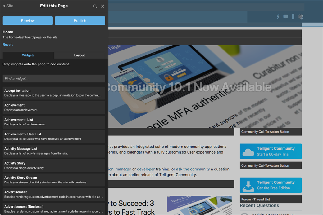
You are now viewing the page editor. Each widget on the header, page, and footer now includes a header. When you place your mouse over the header, you'll be given options to configure the widget (if it supports configuration), manage its responsive behavior (if the theme supports responsive reflowing), change the widget's format, and remove the widget from the layout.
Configuring a widget
When hovering over a widget, select the  option to configure the widget (not all widgets support configuration options):
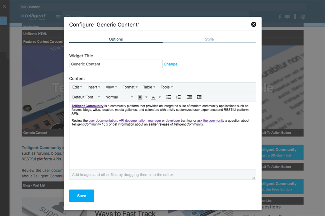
Each type of widget exposes its own set of configuration options. In the screenshot, a Generic Content widget was selected for configuration, so the configuration form allows for the title, content, and style options to be defined. Some widget expose multiple sets of configuration options and, in those cases, a row of tabs appears at the top of the configuration form to enable switching between the different types of configuration options exposed by the widget.
When you're done making changes, click Save. Note that this has not committed any changes and other visitors to the community are not affected. The save is only to your current in-process edit of the page. The widget that you configured will have its preview updated to reflect your configuration changes.
Changing responsive behavior
If the theme supports responsive reflow behavior for small screens, the  icon in the widget toolbar will appear. Clicking it shows the options for responsive reflow behavior:
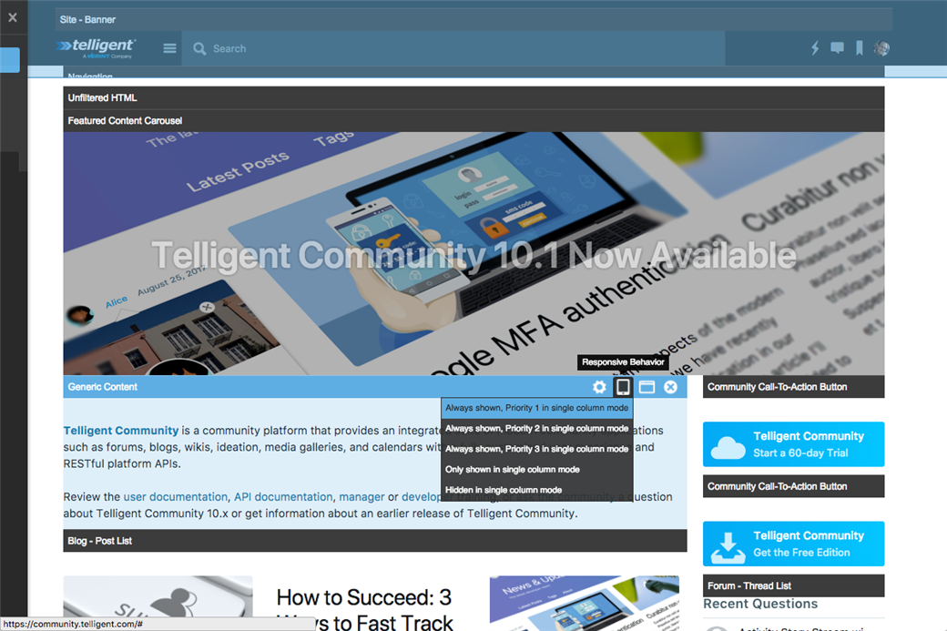
Select the behavior you'd like for this widget:
- Always shown, Priority 1 in single column mode: The widget will be shown in the multi-column layout and single-column layout. When in single column layout, the widget will have a priority of 1 with respect to other widgets.
- Always shown, Priority 2 in single column mode: The widget will be shown in the multi-column layout and single-column layout. When in single column layout, the widget will have a priority of 2 with respect to other widgets.
- Always shown, Priority 3 in single column mode: The widget will be shown in the multi-column layout and single-column layout. When in single column layout, the widget will have a priority of 3 with respect to other widgets.
- Only shown in single column mode: The widget is only shown in the single-column layout. It is hidden from the multi-column layout.
- Hidden in single column mode: The widget is only shown in the multi-column layout. It is hidden in the single-column layout.
For more details on responsive reflow and mobile support, see How does Telligent Community support mobile devices?
Changing the widget's format
A widget's format is a theme-defined list of options controlling how the widget should be styled, selecting the  option shows the list of formats:
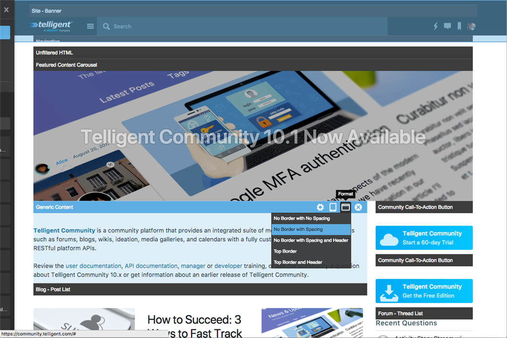
Select the format for the widget from the available options. For the default theme, these options are:
- No Border with No Spacing: The widget will have no borders and no spacing between itself and the widgets around it.
- No Border with Spacing: The widget will have no borders, but will have spacing between itself and the widgets around it.
- No Border with Spacing and Header: The widget will have no borders, will have spacing, and will show its title/header.
- Top Border: The widget will have a top border.
- Top Border and Header: The widget will have a top border and will show its title/header.
Locking a widget
When editing a header, footer, or default version of a page, the widget toolbar will include a lock icon which can be toggled on or off to lock the widget in child contexts. To learn more about locking and inheritance, see What is a theme?
Removing a widget
To remove a widget, select the  option from the widget's toolbar. Note that this change is not committed until the entire page is saved or previewed.
Moving a widget
You can drag and drop widgets to change their order or region within the page. Start dragging anywhere on the widget (its toolbar or content).
Adding a new widget
To add a widget, find the type of widget you'd like from Edit this Page management panel and drag it onto the page where you'd like it to be placed:
Once the widget is placed on the page, it's preview will load and you can use the toolbar options to further configure the widget.
Switching between page, header, and footer editing
The same editing session can be used to make changes to the header, page, or footer. To switch between the header, page, or footer, hover over the area you'd like to edit and click it's Edit Header (or Footer or Page) button:
This will change the Edit this Page management panel to control customizing the layout and widgets in the newly selected area (header, page, or footer).
Changing the Layout
To change the layout, go to the Edit this Page panel and select the Layout tab:
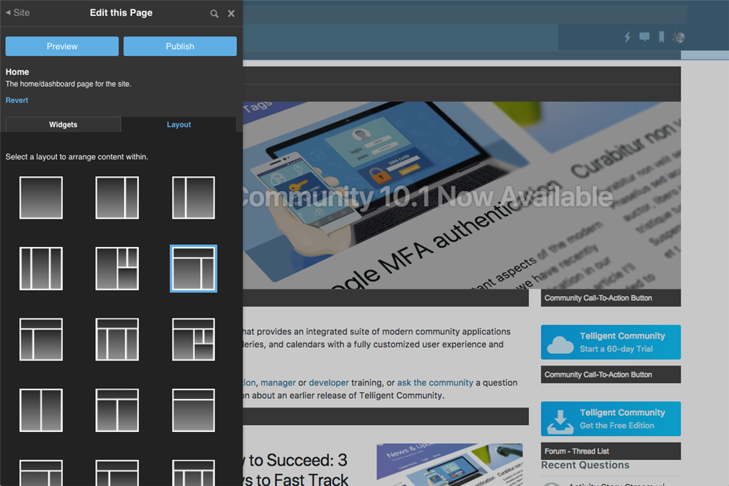
Click on the layout you'd like to use for the current area (page, header or footer) being edited. The existing widgets will be rearranged into the new layout so you can preview the changes easily before fine tuning widget placements by dragging and dropping widgets.
Reverting
As you make changes, you may find that you want to revert changes that you haven't yet published or revert changes to the default for the community. To do this, click Revert on the Edit this Page panel:
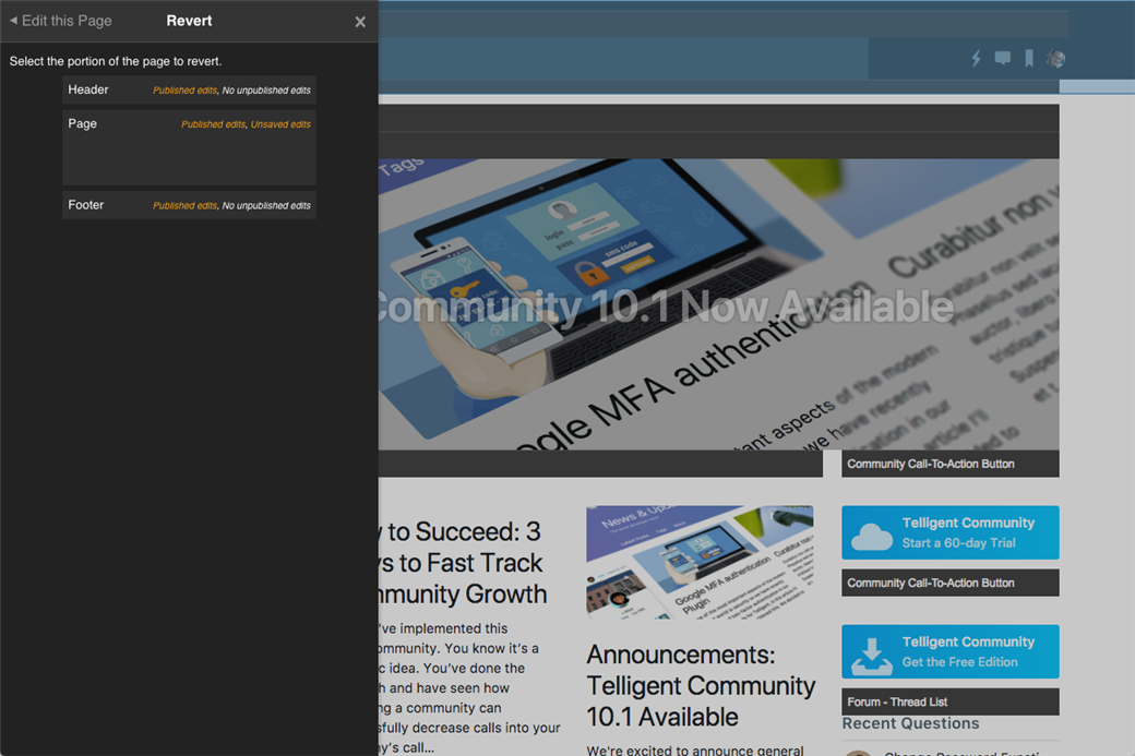
You'll see the header, page, and footer with the current published and unpublished state of each area. To revert an area, click it to see the reversion options. Depending on the edited state, you may be able to revert to the factory default, the configured default, or revert your staged or unsaved edits. As you select to revert areas, the changes will be shown on screen to allow you to make other changes, but they are not yet committed. You'll still need to preview or save/publish them.
Previewing and Saving
When you've made enough changes that you'd like to see a live version, you can chose to preview or save the changes.
Previewing
To preview your changes, click Preview on the Edit this Page management panel. This will save your changes to your personal staging area in Verint Community. Your changes are saved but will not affect or be visible to any other visitor of the community. This will also enable preview mode where, as you navigate around the community, your staged changes are visible to you and only you. This means that you're viewing the community and are able to interact with it and fully review your changes on any device you're signed in on.
When you initially enter preview mode any device you are signed in on will enable preview mode and allow you to preview your staged changes. If you open a new browser or connect to the community on a device after preview mode is enabled, you'll need to go to Manage > Manage Site Theme (or Group Theme or Blog Theme) > Preview Stated Changes and enable previewing.
As you navigate around the community in preview mode, the preview indicator will show on the top left of the browser window. You can click the preview indicator to open the Preview Staged Changes panel and approve / deny changes. See How do I preview UI changes in the community? for more details.
Saving
To save and publish without previewing, click Publish on the Edit this Page panel. The changes you've made will be immediately published and live on your community.
Advanced Editing
For more advanced editing techniques, see How can I rebrand my community in an upgrade-safe way?
Managing Pages and Creating Custom Pages
To view a list of all available pages in a theme or to create a new custom page, go to Manage > Manage Site Theme (or Group Theme or Blog Theme) > Manage Pages:
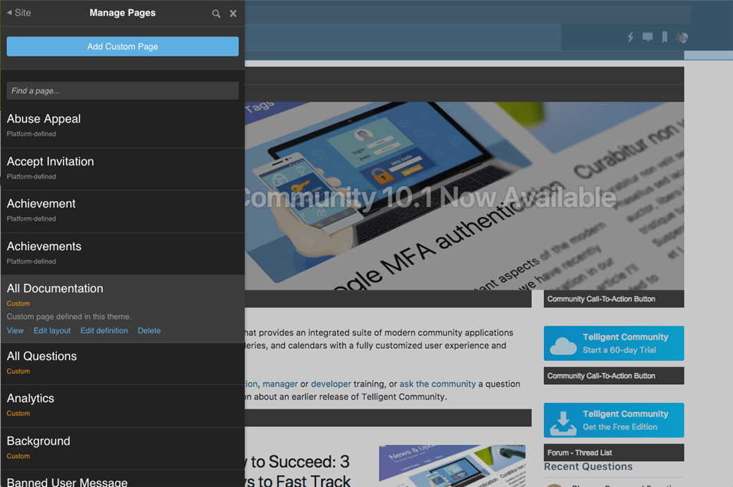
Here you'll be presented with a list of all of the current pages defined for this theme. For platform-defined pages, select the page name for a description of the page and options to view the page or to edit the page's layout. For custom pages, you can view, edit the layout, edit the definition of the page, or delete the custom page complete.
To add a new custom page, click Add Custom Page.
Customizing Theme Options
To customize options exposed by the current theme, go to Manage > Manage Site Theme (or Group Theme or Blog Theme) > Theme Options and review the available options. What options are available depends on the version of Verint Community, the state of the UI migration or upgrade, and what developer-defined options are exposed by the theme. If no options are exposed for customization, the Theme Options panel will not be listed when managing the theme.
Review the available options and make changes. You can preview your changes privately before publishing using the Preview button or Publish immediately.
Creating and Editing Widgets
Widgets themselves can be created or edited to implement new or different functionality. To learn more about widget development, see Widgets in developer training.
Importing/Exporting
Contextual and default theme components are imported/exported from the management panels. Factory defaults can be imported/exported from the administration UI.
Importing/Exporting Default and Contextual Themes
Default and contextual themes are imported/exported from the management panel within the context of the theme you want to import/export. To access importing/exporting:
- Go to Manage > Manage Site Theme (or Group Theme or Blog Theme).
- If you want to import/edit defaults, select Manage Default Site Theme (or Group Theme or Blog Theme).
- Select Import Theme or Export Theme.
When exporting the default or contextual theme, you can either export the current page (if you are currently looking at a page within the theme) or the entire theme. The entire theme contains the header, footer, all effective pages, theme configuration, shared widget configuration options associated to the theme. The export includes defaults or factory defaults if the requested context is not available (according to theme inheritance logic). Note that the default/contextual export is suitable for importing on sites that already have the theme installed, but cannot be used to install a theme that doesn't yet exist on another site (you'll want the factory default export to create the theme on another site).
When importing the default or contextual theme, the Import Theme management panel will show a list of applicable changes from the file being imported. Note that if there are no changes from the current effective configuration of the theme, no options will be presented to be imported. One or more options can be selected and imported for previewing within the current theme being viewed. The imported changes are always staged for your preview -- the changes are not published for other users until you publish them enabling you to make adjustments to imported theme components before publishing.
Importing/Exporting Full Themes
Full themes are imported/exported through the administration UI:
- Go to Manage > Administration > Interface > Themes.
- To import, click Import. To export, locate and select the theme to export and click Export.
The full theme export includes the same theme options as the default/contextual export but also includes all of the widgets referenced by the header, footer, or any of the pages in the theme. The full theme export is suitable for sharing with other sites that don't yet have the theme installed (since it includes the widgets as well).
When importing, the theme components will be staged to allow previewing and editing before publishing.
Best Practices
For a guide to best practices when customizing the Verint Community user experience, see What best practices should be followed when customizing the user interface? and also How do I customize my community in an upgrade-safe way?