
Verint Community provides many ways to customize the look and behavior of your community. Below are best practices to both enable customization but minimize upgrade costs.
For Community Managers
Use the Social theme to better enable future UX upgrades
When upgrading, Verint Community is committed to updating the Social theme and its components.
If you want to implement a radically different theme, you are free to do so by creating a new theme and fully defining it. The cost to a completely custom theme is that your development team will be responsible for the upgrade. Verint Community APIs are upgrade safe and will continue to function, however, your development team will be responsible for including any new functionality provided by updates to the Verint Community platform.
To ease upgrading costs, use the Social theme and reconfigure it using the other best practices in this guide. When you upgrade, you'll be able to make full use of the UX upgrade tools: See How do I upgrade the user experience of my community? for more details regarding upgrading.
Leverage theme options to rebrand the community
The Social theme exposes options to easily brand and customize the styling of the community as well as individual groups and blogs. These options can be customized by going to Manage > Manage Site (or Group or Blog) Theme > Theme Options:
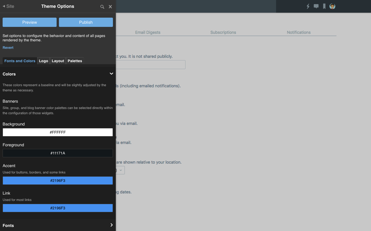
From here, you can adjust the base colors, fonts, and icon. Many widgets in the community are styled using selectable palettes. Within the theme options panel, you can also specify the default for palettes to be used within the theme.
For widget-specific behavior and styling changes, utilize widget options
Individual widgets expose options to enable customizing their behavior on individual pages. Options may be functional or stylistic. To review the options available for a specific widget, edit the page containing the widget and configure it.
Use staging and preview to test changes before publishing
Verint Community includes tools to enable staging multiple UI-related changes and previewing those changes before publication. This enables customization to occur in production environments (reducing the cost of setting up a staging environment, copying data, and deploying changes) and allows you to see how your changes will look with live data immediately and without affecting any other visitors to your site. For more details about how to use the staging and previewing functionality, see How do I preview UI changes in the community?
Review the UI on varying window sizes
Be sure to review your styling and layout changes on multiple devices and at multiple window sizes. Spot test with a handheld iOS and Android device, iOS and Android tablets, small desktop browser windows and large desktop browser windows. Make use of the responsive reflow options to optimize interaction on small handheld devices. For more information about supporting mobile devices, see How does Telligent Community support mobile devices?
Use Unfiltered HTML or Generic Content widgets instead of creating new widgets when applicable
There are reasons to create widgets, even just to render static content, to enable reuse throughout the community. In cases where you need to simply place some static content or some HTML embed code, consider using the Generic Content or Unfiltered HTML widgets to decrease development time. See "Inserting Custom HTML and Content" in How can I rebrand my community in an upgrade-safe way? for more details.
For Developers
Editing vs 'Save as Copy'
When developing widgets and themes, it is important to edit existing platform-defined widgets or themes instead of using the "Save as Copy" feature in most cases, specifically:
- Edit when the changes you plan to make do not significantly affect the purpose or functionality of the widget or theme. If you're making changes to simplify or embellish the widget or to enable a unique layout, you're better off editing the existing widget. Editing existing widgets/themes will ensure that they are reviewed in upgrades for changes to implementation and the platform tooling for diffing and merging will be enabled to add new platform-defined functionality in customized widgets.
- Save as Copy when the widget or theme you're creating serves a different purpose but is otherwise similar in implementation to the source widget or theme. If you're making a completely new widget, for example, that works very differently (or on different data) than the source widget, 'Save as Copy' is a good way to get started. Note that when using 'Save as Copy', the new widget/theme will not have a platform-related upgrade path since you're creating a completely new instance. Your development team is responsible for maintaining and upgrading the functionality of the new widget/theme.
For more details about the widget and UX upgrade process, see How do I upgrade the user experience of my community?
Styling
For theme-wide styling, add a new top-level stylesheet, preferably with your site's name to the existing Social theme. This can define overrides or new global styling.
For widget-specific styling, consider adding a new stylesheet to the widget itself and have the widget render the stylesheet when appropriate. Keeping the styling of widgets with the widget implementation will help when upgrading because the widget-with-styling will be considered a single unit of change when reviewing changes. If, in an upgrade, you want to keep your customizations to one widget but take the platform updates to others, it'll be easier to keep the custom widget with its styling if its versioned together as a single unit and it's styling is separate from other custom styles.
Whether you are implementing a stylesheet in a theme or a widget, make use of theme and widget configuration using the Verint Community LESS functions. This will enable your custom styles to take advantage of existing configuration options (for example, the configurable colors defined in the theme) and be more easily managed by community managers.
FORM elements
Starting with 10.2, the global FORM element is being phased out. Prior to 10.2, all HTML pages generated by Verint Community included a single global FORM element nested directly within the BODY tag. Since 10.2, only upgrades will have the global FORM element enabled by default and it can later be disabled in Administration > Interface > Legacy Options. When implementing form inputs in widgets, ensure that your widget renders the appropriate FORM wrapping element. When the global FORM element is enabled, widget-rendered FORM elements will be removed, but, when the global FORM element is disabled, many HTML forms will require that inputs be placed within FORM elements.
As a general practice, then, for widget development, ensure that you are always rendering FORM tags when appropriate.