
Telligent Community has many tools to enable UI customization (see How do I customize the look and feel of my community? for more details). This article covers specific topics to help rebrand your community in an upgrade safe way.
Upgrade Safety
All communities can be upgraded and support the preview-based user experience upgrade process (see How do I upgrade the user experience of my community? for more details about user experience upgrades), however, developer-oriented changes to the user experience will be most likely to require developer intervention during upgrades. To minimize upgrade effort (especially with regard to developer intervention), customizations should focus on:
- Widget placement, layouts, and configuration
- Custom pages
And avoid:
- Editing widgets
- Significant customization via CSS overrides
This is not to say that editing widgets and adjusting CSS is not supported, only that these types of changes are considered developer-level customizations and will require developer-level review when upgrading.
The remainder of this guide focuses on rebranding with tools that avoid developer-level customization.
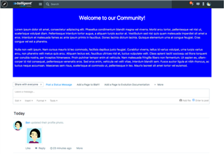
Site Banner
The site banner is the top-most navigation and identification UI on every page of the community. By default, it makes use of the Site Banner widget. The Site Banner widget supports many configuration options to support rebranding:
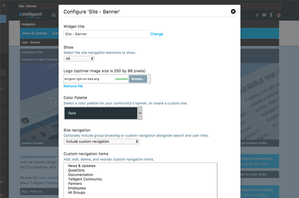
Specifically:
- Logo: Select and upload your community's logo.
- Color Palette: Select the light or dark version or select a custom color palette.
- Site navigation: Enable showing navigation to your top-level groups or choose custom navigation to build a curated list of navigation options.
Alternatively, to incorporate community functions within a more custom persistent banner UI, you can use the Show option to cause an instance of the Site Banner widget to only show the search bar or the community links (sign in, sign out, bookmarks, etc). By using multiple instances of the Site Banner along with other widgets, such as Unfiltered HTML, you can incorporate necessary community functionality (search and user navigation) into a completely custom banner.
Site Footer
Often, footers are defined using the Generic Content or Unfiltered HTML widgets placed within the site theme's footer and locked to ensure that the content is shown on every page. The content of community footers is usually complete custom and static, so definition of the full content can be performed using Generic Content or Unfiltered HTML widgets.
Group Banner
The group banner includes many configuration options to adjust the styling of the banner and can be customized for each group individually:
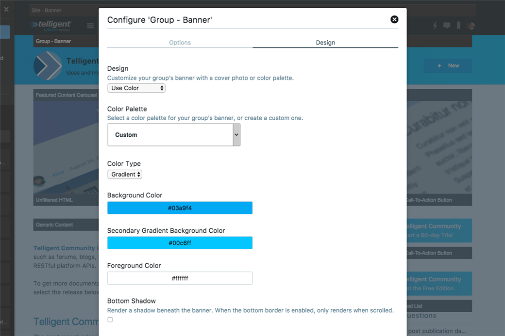
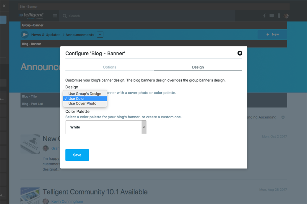
Specifically, on the Design tab, you can customize:
- Design: Whether the banner should use color (or a gradient) or a cover photo.
- For color-based designs, you can choose a predefined color or gradient or a custom one.
- For cover photos, you can choose the photo and whether it should be blurred or not.
On the Options tab, you can select:
- Include Group Avatar: Whether the group avatar should be shown on the banner or not.
- Navigation Items: The links shown in the banner can be customized to provide clear/prioritized options.
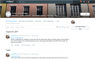
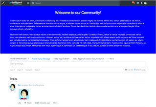
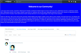
The following screenshots are variations on the group banner using the exposed styling options:
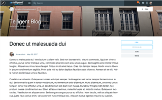
Blog Banner
Blogs can be very personal spaces with unique voices and the blog banner widget supports configuration to personalize the styling of each individual blog to reflect its purpose:
The styling of the blog can inherit styling from the group's design by setting Design to "User Group's Design":
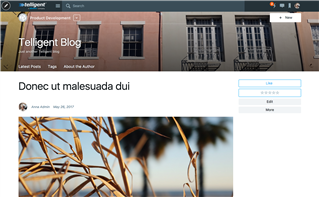
Alternatively, the Blog Banner supports configuring its own branding, including colors and gradients with widget-defined configuration as well as blog-specific cover photos. These branding configurations override the group's own branding configuration. Similar to group banners, cover photos support blur and shadow effect options.
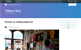
For example, by using a cover photo, the blog's cover photo overrides the group banner's styling to create a seamless banner:
The Group Banner still renders in this scenario to provide group-level navigation and preserve context but its branding inherits the configuration of the blog banner.
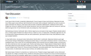
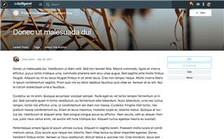
Blogs can benefit from exposing their own set of links to include options to contact the author, view content with a specific tag, or to feature specific posts. The Blog Banner widget supports custom navigation for the blog, for example:
The Blog Banner widget can also be configured to show the current blog post's title instead of the blog's title (by checking Post Title on the Options tab) and optionally show the post's image (by checking Post Image on the Options tab), for example:
Inserting Custom HTML and Content
Often, when branding a community, you'll have the need to insert some static content into the layout of a page, header, or footer or you may have some HTML and Javascript from another web property to incorporate into a custom header or footer. In these situations, the Generic Content and Unfiltered HTML widgets are useful. These two widgets enable similar behavior--the insertion of static content--but differ in subtle but important ways:
- Generic Content: This widget provides a rich text editor to define the content. The content supports embedding rich elements like polls, images, or videos but is also subject to content filtering (which includes HTML sanitization) so it generally does not allow Javascript. Generic Content is usually enabled to be used by all members with access to edit page layouts.
- Unfiltered HTML: This widget provides for direct insertion of raw content into the page layout--HTML, Javascript, CSS, etc can be embedded without any content filtering-based adjustments. This widget is usually restricted to only allow use by community administrators but is the best solution to insert raw embed codes or raw HTML with scripts when applying raw branding content from another web property or static design.
Both widgets support styling options to enable better integration into the Social theme:
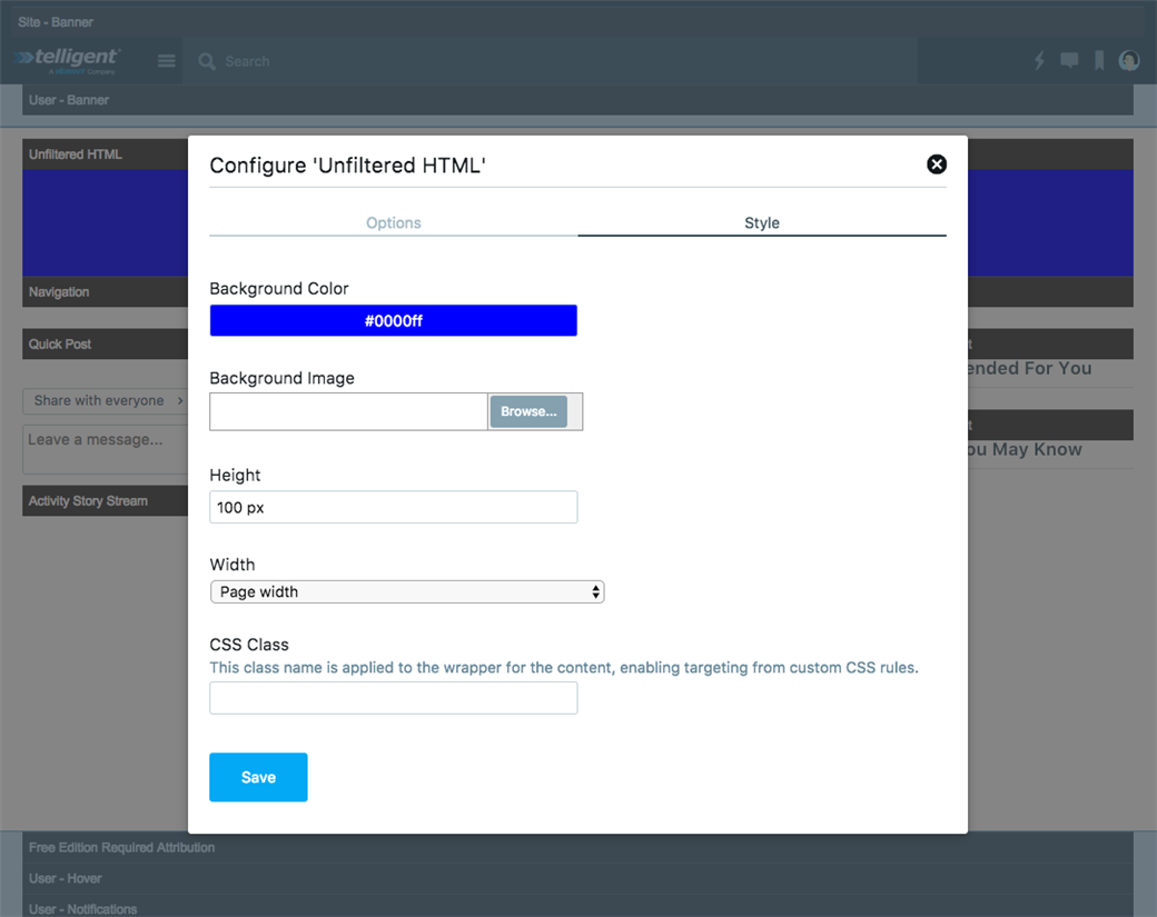
- Background color / image: Defines the background to be placed behind the content of the widget.
- Height: An explicit height to better enable specific placement alignment of this widget or to confine the height of external markup.
- Width: To simplify common layout requirements, the widget can be configured to control width in a few layout-specific ways:
Page width:
Background at window width, content at page width:
Window width:
- CSS Class: This will apply this CSS class to the wrapper of the widget to enable 1-off styling of this instance of the widget using an external or theme-embedded CSS file.