
Themes are used by Verint Community to layout, style, and organize the functionality of the web user experience.
A theme defines the cascading stylesheets, global javascript, and the functionality included in the header, content, and footer of every page within a specific context: site, group, or blog. Within each context, a theme can be selected and customized.
Theme Components
Each theme contains multiple components:
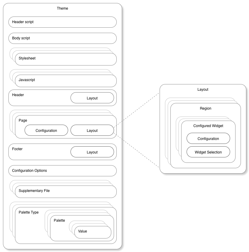
In essence, the header script renders HTML headers (think of the contents of the <head></head> element) and the body script renders HTML body (contents of the <body></body> tag). These scripts are implemented in the Velocity templating language and can make use of the Verint Community widget API and theme-specific rendering APIs as well as the other theme components:
Stylesheets
Stylesheets are CSS, LESS, or Velocity (VM) files in a configurable order with specific styling-specific configuration options used to provide global styling to the theme. Stylesheets are generally rendered via the header script using the $context_v2_themeHeader.RenderStylesheetFiles() API.
Javascripts
Javascripts are JS or Velocity (VM) files in a configurable order that implement global client-side behaviors using javascript. Javascript files are generally rendered via the header script using the $context_v2_themeHeader.RenderJavascriptFiles() API.
Configuration Options
The theme can also expose its own configuration options. These options could be specific values (how large should the base font be?) or full files or lists of files (what should the favicon be?). The theme can read configuration values in Velocity and LESS files to adjust how the theme looks or behaves.
Palette Types
Palettes types are categories of palettes used for a specific purpose. Generally palettes are used to provide a set of selectable options to widgets within the theme. For example, the site banner uses a palette defined in the Social theme that includes configuration for colors, lines, and shadows in a single selectable list. Within a specific site, group, or blog, palette defaults can be selected in the front UI when configuring the theme. The theme and widgets can make use of palettes to centralize sets of selectable options.
Supplementary Files
Supplementary files is a general location to put files required by other components of the theme--for example, images, fonts, or CSS/LESS files to include in stylesheets.
Or, in other words, a theme is a set of configuration (which may include embedded files such as CSS, images, fonts, etc) with a header, footer, and set of one or more pages. Each header, footer, and page defines a layout containing multiple regions which may contain zero or more configured widgets.
Header / Page / Footer
The header, page, and footer represent selections of widgets in layouts that implement the functionality of individual pages rendered in a theme. The header is at the top of every rendered page. The footer is at the bottom of every rendered page. Each page is used to implement the behavior of one or more specific URLs or a custom page (created by adding a page within the Manage Pages theme management option). Generally, the body script decides where to render the header, page, and footer using the $context_v2_themeBody.RenderHeader(), $context_v2_themeBody.RenderPage(), and $context_v2_themeBody.RenderFooter() APIs. Each header, page, and footer contains similar components:
Layout
A layout is a visual arrangement of regions where widgets can be placed. For example, Verint Community includes a layout with a wide content column on the left or a narrower right sidebar column. The layout's regions provide the framework into which widgets can be added to define the look and functionality of a page, header, or footer.
Widgets
Widgets are functional pieces of the user interface that can be rearranged within the layout of a header, page, or footer. Widgets provide the content and interaction on each complete page of the theme. Developers can create new widgets for use within themes--see Widgets in Developer Training for more details.
Theme Versions
Headers, footers, and pages exist in up to three different versions:

The factory default represents the original implementation that is used if no edits have been made within the community UI. After installing Verint Community, all pages that are rendered are from the factory default version of the theme.
The default version overrides the factory default version without editing it. Defaults are editable through the community UI and enable visual configuration of the default used for all contexts of a theme, for example, all groups or all blogs.
The contextual version is the version most edited. When directly editing within a group or blog, for example, the contextual version of the theme is edited. Changes apply only to that context (that group or blog) and not the default (which applies to all groups/blogs) or the factory default (which should represent the original/known-good version).
When loading theme components, if the requested component is not available from the requested version, the next lower version is requested. For example, if the contextual version of a page is requested for a group but the group never edited the page, the default version would be requested. If the default version was never edited, the factory default would be used.
Theme Inheritance
Some theme components can also be inherited. Headers/footers and pages are inherited differently.
Header/Footer Inheritance

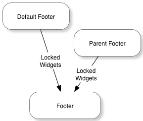
When rendering a header or footer, first, any locked configured widgets from the default implementation are merged into the header/footer. Next, if the theme is configured to inherit headers/footers from the parent theme, the parent's configured widgets will also be merged into the header/footer before rendering.
The parent theme is the logical parent of the current context. For example, the parent of a blog is the group in which the blog belongs and the parent of a group is the site. If a theme of the same name is available for the parent context, the parent header or footer is retrieved from that theme. If a theme of the same name is not available, the parent context's current theme is used to retrieve the parent header or footer.
Page Inheritance
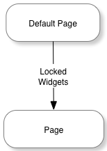
When rendering pages, only locked widgets from the default implementation of the page are merged into the page before rendering.
Widget Merging in Headers, Pages, and Footers
When merging widgets, the platform first attempts to find the source widget on the target header/footer/page. A match is found when a widget of the same type (same name, for example) and same configuration is found or a widget that was a direct descendent of editing the default implementation of the header/footer/page still exists on the target header/footer/page.
If no matching widget is found (or the matching target widget is already identified as matching a different source widget), the source widget will be copied to the target header/footer/page. When copying, the widget will be placed in a region appropriate/comparable to the location of the widget in the source header/footer/page at the same region-specific offset. So, if the source widget was the third widget in the right sidebar in the source page, it will be placed (if a matching widget wasn't found in the target page) in the right sidebar (or similar region) as the third widget in the target page when merging.
Note that when merging widgets due to inheritance, only locked widgets are merged. Locking is an option when editing the default version of a page or when editing headers/footers.
Inheritance
The theme can decide whether to inherit configuration values, javascripts, stylesheets, or the entire header from parent themes. A theme can chose to make the inheritance an option for end-users or dictate how inheritance will work within the theme.