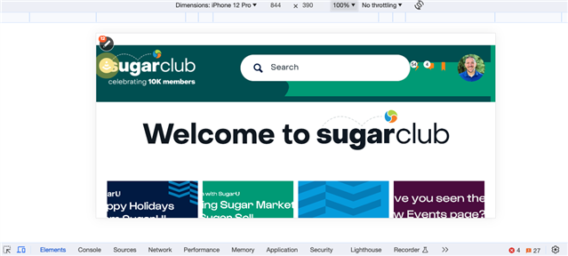
How do we give mobile the full RTE experience? Menus and Options are Missing

Here's an example:

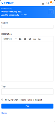
There's only "Paragraph" and text alignment, with inserting content.

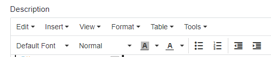
How do we get the rest to appear?

This is what you see on a desktop environment:

This lack of options severely hinders mobile interaction and content creation.

This is the same behaviour in our instance of the Verint community.


Typo in title
[edited by: Christopher G. Stanton at 11:04 AM (GMT 0) on Wed, Nov 29 2023]
Parents
  • The full set of editor options may not currently work well in mobile browsers (especially in situations where selection state is required--non-block-level actions, for example). You can provide the full experience, however, by adjusting the mobile browser user agent pattern in Administration > Site > Editor Options and changing "Mobile Browser User Agent Pattern"

    We are reviewing updates to the editor to provide the same UI for all browsers in a future release.

Reply
  • The full set of editor options may not currently work well in mobile browsers (especially in situations where selection state is required--non-block-level actions, for example). You can provide the full experience, however, by adjusting the mobile browser user agent pattern in Administration > Site > Editor Options and changing "Mobile Browser User Agent Pattern"

    We are reviewing updates to the editor to provide the same UI for all browsers in a future release.

Children
  • Thanks  ,

    What other areas may be affected by the mobile browser user agent pattern beyond the RTE? I would be hesitant to make a change for one particular functionality and find it affects rendering in negative ways that are unintended Slight smile

    We are reviewing updates to the editor to provide the same UI for all browsers in a future release

    Woohoo! That's great because I can't access the pencil on mobile either!

  • What other areas may be affected by the mobile browser user agent pattern beyond the RTE?

    The mobile pattern configured on Editor Options is only used to determine which configuration (desktop or mobile) to provide. It is not used by other functionality.

    That's great because I can't access the pencil on mobile either!

    Sorry, I was specifically talking about standardizing the editor UI. On mobile/touch-enabled devices, you can open the management panel by swiping from the left side of the screen.

  • That's great because I can't access the pencil on mobile either!

    For what it's worth - I can in horizontal/landscape mode since that still serves up the desktop view for me. I'm not sure if that's standard or dependent on my site's theme configuration plus my device size (iPhone 13). Comes in handy every so often when something happens and I'm not near my computer. 

    (Didn't know about that issue with our banner either, need to fix that Rolling eyes)

    On mobile/touch-enabled devices, you can open the management panel by swiping from the left side of the screen.

    It took me a few tries to trigger it but I didn't realize that was an option -- very helpful!

  • On mobile/touch-enabled devices, you can open the management panel by swiping from the left side of the screen.

    Wow, there is nothing on screen that shows or suggests this at all at present. That doesn't work for me, swiping from the side in the browser acts as the "back" or "go back" functionality.

    In this screen recording you can see the touch registers to the actions I am doing, and that there's an orange '2' in the corner to denote admin notifications:

    The mobile pattern configured on Editor Options is only used to determine which configuration (desktop or mobile) to provide. It is not used by other functionality.

    Thanks for confirming.