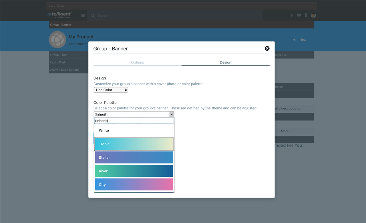
Theme palettes allow themes to expose sets of configuration options to theme managers to make groups of configuration easier. The theme, widgets, and other scripted customizations can expose options to select a palette from the current theme and retrieve specific values from the theme-defined palette values.
[toc]
When Would I Use Palettes?
Palettes are useful to theme developers to allow controlled sets of key/value options to be selected by theme managers as a consolidated option with a unique preview instead of exposing lower-level options that could be overwhelming or abused.
For example, the site theme defines palettes that can be used for banner styling. These are all predefined by the theme and represent multiple key/value pairs (some stylistic, some functional) that are consolidated behind simpler selectable named options. The theme can add and remove palettes to meet the branding needs of the community ("we only support these colors", "all banners should look the same", etc can be implemented by adding/removing banner palettes in theme studio). When a group manager edits the group theme, the group banner widget exposes a palette selection from the list made available by the site theme. The group manager can select the palette and all of the configuration options associated to that selection can be read by the group banner widget to implement the style and behavior of the selection. If customizations are later made to the group banner widget and additional options are exposed, they can later be added to the palette definitions without requiring the group manager to reconfigure the group banner.
XML Palette Definition
Themes can define palettes to be consumed by scripted customizations using the palette XML format:
[
<paletteType>
  [
  <palette>
    [<value />]*
  </palette>
  ]*
</paletteType>
]*
One or more palette types can contain one or more palettes each. Each palette can then contain one or more values, of any type.
Palette values can be retrieved within widgets and the theme using the core_v2_theme widget extension and -evo-themepalette-* LESS functions.
The palettes of a given palette type can be selected in a theme or widget's configuration with a themepalette configuration property template.
<paletteType />
<paletteType id="" name="" >...</paletteType>
Defines a grouping of palettes. The palettes of a given palette type can be selected in a theme or widget's configuration with a themepalette configuration property template.
Attributes:
- id is the identifier for the palette type.
- name is the name of the palette type
<palette />
<palette id="" name="" [cssClass=""] [previewCss=""] [default=""] >...</palette>
Defines a grouping of selectable palettes. The palettes of a given palette type can be selected in a theme or widget's configuration with a themepalette configuration property template.
Attributes:
- id is the identifier for the palette.
- name is the display name for the palette.
- cssClass is the optional CSS class applied to the palette option when rendered in a
themepaletteconfiguration property template. - previewCss is the optional inline styling applied to the palette option when rendered in a
themepaletteconfiguration property template. - default is a boolean (true or false) identifying whether this palette should be the default selection within a palette type when no other palette has been selected.
<value />
<value id="" dataType="" >value</value>
Defines a value within a palette.
Attributes:
- id is the identifier for this value. This is the identifier used when retrieving selected palette values via the
core_v2_themeextension methods within widgets and-evo-themepalette-*LESS functions. - dataType is the data type of this value. Possible data types are:
- Int is an integer value.
- String is as a string value.
- Color is a CSS color value.
- Unit is a CSS unit.
- Double is a double-precision floating point value.
- value is the value
Exposing Palette Selections
Palette selection from a known palette type are usually exposed via configuration properties in themes and widgets using the themepalette property template:
<property id="propertyId" labelResourceName="nameResource" descriptionResourceName="descriptionResource" dataType="String" template="themepalette" paletteTypeId="paletteTypeId" />
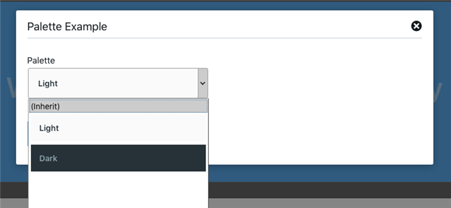
The paletteTypeId attribute would be set to the name of the palette type identified by the current contextual theme (or one of its ancestors). This will render the list of palette options and allow for the selection of one of the defined palettes:

The value stored will be the palette's identifier.
Using Palette Selections
Palettes can be used by scripted customizations in server-executed code or LESS files to make use of the configuration values associated to a palette selection using the palette APIs:
- In LESS,
- -evo-themepalette-color
- -evo-themepalette-double
- -evo-themepalette-int
- -evo-themepalette-string
- -evo-themepalette-unit
- -evo-widgetpalette-color
- -evo-widgetpalette-double
- -evo-widgetpalette-int
- -evo-widgetpalette-string
- -evo-widgetpalette-unit
- In Velocity and Server-side Javascript,
- core_v2_theme.GetPaletteColorValue
- core_v2_theme.GetPaletteDoubleValue
- core_v2_theme.GetPaletteIntValue
- core_v2_theme.GetPaletteStringValue
- core_v2_theme.GetPaletteUnitValue
See the inline API documentation in Theme Studio, Widget Studio, or Automation Studio for more details.
When working with values on the server, note the data representation:
| Palette value data type | Server data type (.Net) | Client data type (Javascript) |
|---|---|---|
| Int | Int32 | Number |
| String | String | String |
| Color | Telligent.Evolution.Extensibility.Configuration.Version1.Color | String representation of the color: #RRGGBB, #RRGGBBAA, rgb(1-255, 1-255, 1-255), rgba(1-255, 1-255, 1-255, 0-1), hsl(1-255, %, %), hsla(1-255, %, %, 0-1), or a named HTML color. |
| Unit | Telligent.Evolution.Extensibility.Configuration.Version1.Unit | String representation of a CSS unit, a px, pt, pc, in, mm, cm, %, em, ex, ch, rem, v2, or vh value. |
| Double | Double | Number |
Example
The Social site theme defines a palette type named "siteBanner" to define sets of styling and behavior options for site banners using the palette XML format in Theme Studio:
<paletteType id="siteBanner" name="${resource:palette_type_site}">
	<palette id="light" name="${resource:palette_light}" previewCss="background-color:#FAFAFA; color:#263238; padding:15px; font-weight:600;">
		<value id="background-color" dataType="Color">#FAFAFA</value>
		<value id="foreground-color" dataType="Color">#263238</value>
		<value id="search-color" dataType="Color">#FFFFFF</value>
		<value id="active-color" dataType="Color">#263238</value>
		<value id="border-color" dataType="Color">#CFD8DC</value>
		<value id="include-border" dataType="Int">1</value>
	</palette>
	<palette id="dark" name="${resource:palette_dark}" previewCss="background-color:#263238; color:#90A4AE; padding:15px; font-weight:600;" default="true">
		<value id="background-color" dataType="Color">#263238</value>
		<value id="foreground-color" dataType="Color">#90A4AE</value>
		<value id="search-color" dataType="Color">#3b4d56</value>
		<value id="active-color" dataType="Color">#ffffff</value>
		<value id="border-color" dataType="Color">#CFD8DC</value>
		<value id="include-border" dataType="Int">0</value>
	</palette>
</paletteType>
Within Widget Studio, a widget could then be created to allow the selection of a palette from this type by defining dynamic configuration:
<propertyGroup id="options" labelText="Options">
    <property id="palette" labelText="Palette" dataType="string" template="themepalette" paletteTypeId="siteBanner" />
</propertyGroup>
The widget could consume the configured value in a custom LESS file to set the foreground and background colors of the widget:
.content-fragment.palette-example {
    background-color: -evo-widgetpalette-color('siteBanner', 'palette', 'background-color');
    color: -evo-widgetpalette-color('siteBanner', 'palette', 'foreground-color');
}
Within Velocity script in the widget, palette values can also be referenced as well. For example, the "include-border" palette value is rendered:
#set($includeBorder = $core_v2_theme.GetPaletteIntValue('siteBanner', $core_v2_widget.GetStringValue('palette', ''), 'include-border', 0, 10))
Include Border:  #if ($includeBorder > 0) Yes #else No #end
This widget would then be rendered as:

using the default palette selection of "dark." The default palette selection can then be set in the theme or Theme Options (Manage > Manage Site Theme > Theme Options) or the palette can be selected for this widget only via the widget's configuration:

You can download the full Palette Example widget here: PaletteExample-Widget.xml
