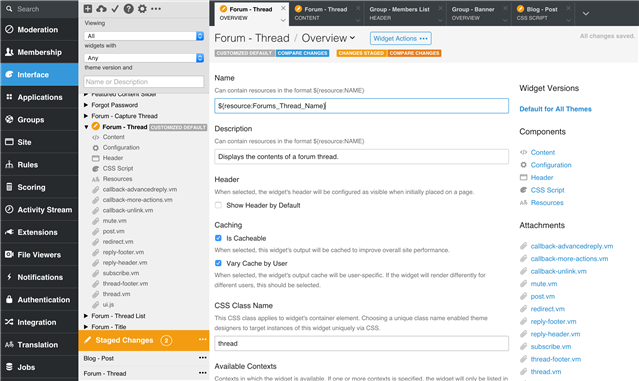
Widget Studio is an interface in the Administration UI which provides complete management and authorship of widgets directly within Verint Community. It is available by navigating to Administration > Interface > Widgets.
[toc]
When would I use Widget Studio?
Widget Studio is used for both widget management and widget authoring. Example uses include:
Widget management
- Browsing widgets
- Importing widgets
- Exporting widgets
- Reviewing and publishing widget changes
- Importing and exporting of widget language resources
Widget authoring
- Editing existing widgets
- Creating new widgets
- Comparing and live-previewing widget changes
- Reverting changed widgets
- Reviewing widget API documentation
The Interface
It is helpful to understand the major components of the new Widget Studio interface before diving into management and authoring details.
Browse View
The browse view on the left supports viewing the set of installed widgets.
Tree
The tree lists both widgets as well as their components such as content script, resources, and attachments. Widget nodes identify the widgets' version and staging states, including whether the widget is a customized default, fully custom, or themed. If the widget has staged changes, a yellow pencil indicator is shown.
Filtering
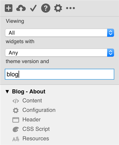
Widgets can be filtered by
- Widget Type:
- All: All Widgets, excluding those provided by scripted plugins
- User Installed: Widgets created or imported via Widget Studio
- Default: Factory default widgets provided by the platform or third-party plugins
- Edited Default: Factory default widgets which have been customized with overrides in Widget Studio
- Provider: Provider Name: Widgets provided by specific factory default providers, including scripted plugins.
- Theme:
- any: any theme version
- Theme Name: widgets that have a themed version specifically for the theme name selected
- Text search:
- Text that matches the widget's name, description, or attachment name
Browse Actions
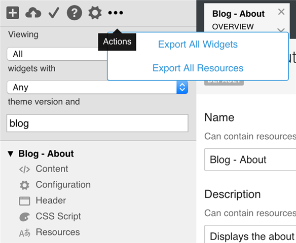
Browse actions are available above the tree
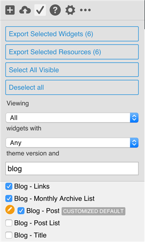
- New: Create a new widget
- Import: Upload widgets or widget resources
- Multi-Select: Toggle multi-selection of multiple widgets for export
- API Documentation: View API Documentation
- Settings: Widget Studio settings
- Export All Widgets: Exports all widgets that are available to view
- Export All Resources: Exports all resources, even from any widgets which aren't available to view or edit
Widget Actions
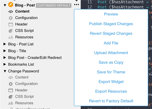
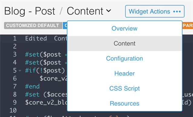
Widget actions are available alongside each widget node in the tree. These same actions are also available in widgets' edit views. The exact set of widget actions can very based on the state of the widget, and update automatically in response to widget state changes. Details about these actions are available within the Management and Authoring sections below
- Preview: Live-preview the widget in the user interface
- Publish Staged Changes: Publishes staged changes, if any exist
- Revert Staged Changes: Reverts staged changes, if any exist
- Add File: Adds a new editable attachment to the widget
- Upload Attachment: Uploads a new attachment of any type to the widget
- Save as Copy: Creates a new widget as a copy
- Save for Theme: Creates a themed version of the widget
- Export Widget: Exports the widget
- Export Resources: Exports the widget's language resources
- Delete or Revert: Deletes a custom widget or reverts a customized default to a factory default
Multi-selection
Multi-selection enables selecting multiple widgets for widget or resource export. Multi-selection is not as inclusive as the Export All Widgets or Export All Resources options, as some widgets may not be available for viewing or editing though their resources are still editable.
Staging View
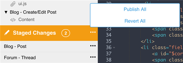
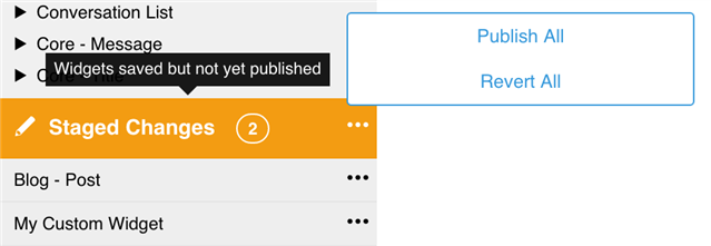
When one or more widgets is staged, the staging view is shown.
When a widget is edited, (including everything from content script changes to just importing resource translations) the changes are staged. Staged changes are only visible to the user performing the change.
Staged widgets can be published or reverted back to their non-staged state. Staged changes can also be viewed n the site with live updates as widgets change, only for the user making the change.
The staging view lists all currently-staged widgets, along with actions to preview and publish or revert single widgets or all of them at once.
Tab View
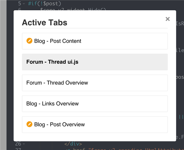
Widget Studio supports viewing and editing multiple components from multiple widgets simultaneously. Each component is opened on its own tab, which the tab view navigates.
Each tab lists the name of the widget, the component, its yellow staged state (if staged), with links to close the tab, close all other tabs, or reveal the staged component within the tree (if not already focused) for greater context.
Tabs can be re-ordered via drag and drop, and tabs overflow into a dropdown revealing less used tabs.
Editor View
The editor view area displays multiple types of editing experiences, depending on the component. Editor views could include Velocity script, Velocity script, language resources, attachments, and more.
Component Navigation and Actions
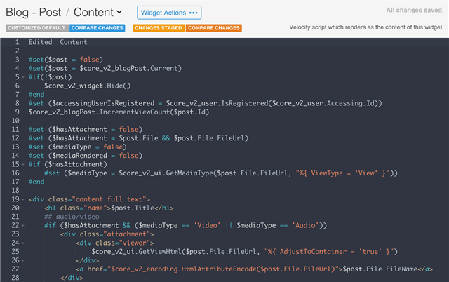
Each editor view identifies the widget's theme (if it has one), its name, the component being edited with links to all other components in the widget, and widget actions. Widget actions are the same as those available from the Browse View.
Diffing
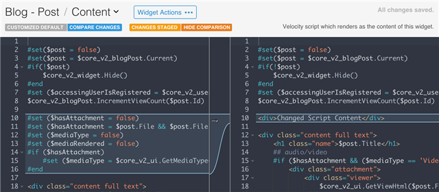
If a widget is staged, it is identified as such with a button to Compare Changes with the current published version. If the widget is a customized default, another button is shown to Compare Changes with the default.
Selecting either Compare Changes button will switch the editor view to comparison mode where the left side is the original and the right side is the edited version. For most editor views types, comparison view still allows editing while in comparison view.
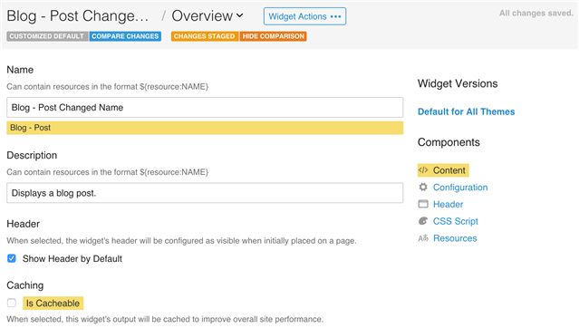
When using the Compare Changes tool on a Widget's Overview, all components that have changes are highlighted in yellow.
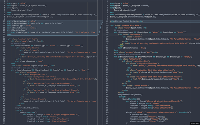
Full Screen Editing
Most editor view types support being edited in full screen. Select Full Screen to toggle.
Managing Widgets
Browsing Widgets
Importing Widgets
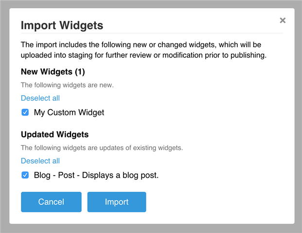
Widgets can be installed from widget export files by selecting the Import button in the Browse View. A single widget export file can be selected (which can potentially contain multiple widgets). A confirmation will be shown before import like the following. Note that widgets that are either new or updated are identified as such with the option to not import them.
Imported widgets are imported to a staged, non-published, state, the same as if the widgets had been edited directly within Widget Studio. This allows for further review of changes and differences using the Compare tools in editor views prior to eventually selecting publish or revert. Thanks to staging, importing is a safe action which does not affect the published user interface, and can be fully reverted instead of published.
Once published, imported widget updates install either as custom defaults (if there was a default version) or as a new version of the existing custom widget, overwriting the previous.
Exporting Widgets
Any widget, whether Factory Default or Custom, can be exported. A widget export includes widgets' script, configuration, attachments, and resources. A single export file can contain multiple widgets.
To produce a widget export select Export Widget from a widget's actions in the Tree View or any of the widget's components' edit views. Alternatively, multiple widgets can be exported in a single file by entering multi-select mode in the Browse View, checking widget checkboxes, and then selecting Export Selected Widgets.
Publishing or Reverting Staged Changes
Staged changes can be published or reverted using Widget Actions in the Browse View, editor view, or in the Staging View.
Deleting or Reverting changes to Widgets
Custom widgets can be fully deleted. Factory defaults cannot be deleted, but customized versions of factory defaults can be reverted back to their original.
To delete or revert a widget (depending on its type), select Delete or Revert from Widget Actions.
Importing and exporting Language Resources
Widget exports include all language resources used by those widgets. Widget Studio also supports exporting and importing only the language resources for widgets.
To export a widget language resources, select Export Resources from Widget Actions. Alternatively, multi-select mode can be used export multiple widgets' resources.
To translate all widget-based user interfaces in the Community, use Export All Resources, as some widgets may not be available for viewing, editing, or multi-selection.
Authoring Widgets
Editing Widgets
Editing and Saving
To edit a widget, navigate to one of its components in the tree view. All changes are automatically saved to staging. Staged widgets can be used and configured on the site by the developer, but are not publicly available until publishing.
Comparing Changes
As widgets are edited, staged changes can be compared with the non-staged by selecting Compare Changes. For most widget component views, edits can continue to be made while in comparison view.
Previewing Changes
Widgets can be previewed by selecting Preview in Widget Actions. If the widget is currently in use, a new browser window will be opened to a page using the widget, pre-loaded to Preview mode. Preview mode renders the widget's staged version, automatically refreshing the host page as widget changes continue to be saved.
Publishing or Reverting Staged Changes
Staged changes can be published or reverted using Widget Actions in the Browse View, editor view, or in the Staging View.
Creating new Widgets
Creating a new Widget
To create a new Widget, select New Widget in the Browse View. While widget changes are automatically saved, new widgets are not created until at least one field is edited. If not provided, widget names are automatically provided. As with all edits, new widgets are saved into staging. Staged widgets can be used and configured on the site by the developer, but are not publicly available until publishing.
Branching a widget to a theme-specific version
By default, a given Widget functions identically in any theme. A theme-specific Widget is only used when that theme is selected. A theme-specific widget defines its own complete set of content, configuration, attachments, and resources and can potentially vary significantly in implementation from its base.
To create a theme-specific version, select Save for Theme in Widget Actions. Widget Studio will prompt for which theme to save against before staging a themed variant.
Branching a widget to a new, separate, widget
To save a copy of a widget as a new, separate, widget that does not overwrite the original, select Save as Copy from Widget Actions. The new widget will be staged with a copy of the source widget's content, configuration, attachments, and resources and will not affect existing usages of the source widget.
Deleting or Reverting a widget
A widget which was imported or created via the Widget Studio can be deleted, but not reverted. A Factory Default widget can be neither deleted nor reverted. However, a customized version of a factory default (a factory default which has been "saved" against through Widget Studio) can be reverted back to its original Factory Default state. The type of widget being viewed determines whether a Delete or Revert button is presented.
Widget Components Definitions
Overview
Both Name and Description support resource tokens to allow for localized names. So, if a widget is titled "Hello World", "Hello World" can optionally be defined as a resource named title_hello_world and the 'Name' field for the widget can contain ${resource:title_hello_world}
Show Header by Default defines whether the header of a widget is shown by default. The selected wrapping format when placing a widget can override this choice.
Is Cacheable defines whether a widget's output should be cached by the site. This should be enabled whenever possible, which includes when a widget is not Accessing-user-specific, or is user-specific but can be cached per user.
Vary Cache by User defines whether a cached widget should use the same output for every accessing user or a separate cached copy for each. A widget whose content is specific to the accessing user should vary cache by the user.
To allow for easier styling of a widget from a theme, a widget can define its own unique CSS class which is applied to its wrapping div element. CSS selectors can then be targeted to specific descendants of the class as follows
.content-fragment.social-share h2 { color: red; }
Without defined available contexts, a widget can be placed in any region on any page, header, or footer. With specified contexts, a widget can only be placed in certain regions dependent on the context. For example, a widget that only works when there is a current Blog Post in context would want to specify the 'Blog Post' context. Multiple available contexts can be defined.
Main Content Script
Widget content is defined Using Velocity-templated markup. Along with all velocity directives, the entire Platform API is available to widget content script via Widget Extensions as documented in the Widget API Documentation.
Configuration Script
Widget Configuration is defined with XML which specifies the dynamic configuration fields available to the administrators that use and configure the widget.
Header Script
Header Script optionally declares velocity script which, when evaluated, generates the content displayed in a widget's header. When not provided, a widget's header will be equivalent to its title.
A common pattern for Header Script when a widget's title is configurable is to use the following configuration...
<property id="Title" resourceName="Property_Title" dataType="String" defaultValue="${resource:Widget_Title}" controlType="Telligent.Evolution.Controls.ContentFragmentTokenStringControl, Telligent.Evolution.Controls" />
...and the following Header Script...
$core_v2_widget.ApplyTokens($core_v2_widget.GetStringValue('Title', '${resource:Widget_Title}'))
This allows for the widget configuration to expose editing of the title while still supporting resource tokens.
CSS Script
CSS Script can be defined with Velocity script to dynamically define what CSS classes are applied to the widget's wrapper.
Language Resources
Widgets can define all of their own resources for localization. Resources component allows for defining resources for each currently-enabled Language pack. Resources can be exported and imported independently of widgets when Managing Widgets.
A defined resource can be referenced via widget script as:
$core_v2_language.GetResource("resource_name")
Attachments
Any file type can be attached to a widget, including images, JavaScript, stylesheets, web fonts, and more. To attach files, select Upload Attachment from the Widget Actions.
Uploaded attachments that are known editable text formats including CSS, JavaScript, HTML, XML, and VM (velocity) are editable in Widget Studio. Other file types are previewed on their own component tabs.
Advanced User Interface Features
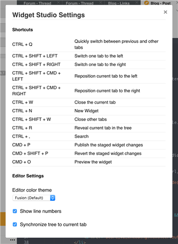
Keyboard Shortcuts
Widget Studio supports the following keyboard shortcuts
- CTRL + Q: Quickly switch between previous and other tabs
- CTRL + SHIFT + LEFT: Switch one tab to the left
- CTRL + SHIFT + RIGHT: Switch one tab to the right
- CTRL + SHIFT + CMD + LEFT: Reposition current tab to the left
- CTRL + SHIFT + CMD + RIGHT: Reposition current tab to the right
- CTRL + W: Close the current tab
- CTRL + N: New Widget
- CTRL + SHIFT + W: Close other tabs
- CTRL + R: Reveal current tab in the tree
- CTRL + ,: Search
- CMD + P: Publish the staged widget changes
- CMD + SHIFT + P: Revert the staged widget changes
- CMD + O: Preview the widget
Settings
The following settings are available in Settings
- Theme: Syntax highlighting color scheme
- Show Gutter: defines whether line numbers are shown
- Highlight Line: defines whether the current line is displayed
- Show invisibles: defines whether non-visible characters such as tabs and line breaks are rendered

