Dynamic configuration is a metadata-based dynamic form generation format used by widgets to define configuration options.
[toc]
When would I use Dynamic Configuration?
Dynamic configuration is necessary when a developer wants to expose configuration options on a widget to administrators and other non-deveopers. Dynamic configuration is defined as XML on a widget in Widget Studio.
XML configuration definition
[
<propertyGroup>
  [
  <property>
    [<propertyValue />]*
    [<propertyRule />]*
  </property>
  ]*
</propertyGroup>
]*
One or more property groups can contain one or more properties each. Each group is represented as a tab on the widget configuration window and each property stores a single value. Each property can optionally define selectable values and rules.
Property values can be retrieved within widgets using the get and set methods on the $core_widget extension.
<propertyGroup />
<propertyGroup [id=""] [resourceName="" [resourceFile=""]] [text=""] [descriptionResourceName="" [descriptionResourceFile=""]] [descriptionText=""] [orderNumber=""] [visible=""] [other attributes]>...</propertyGroup>
Defines a grouping of configuration properties. Within the widget configuration window, each group is represented by a tab.
Attributes:
idis the identifier for the group.resourceNameis the name of the language resource identifying the name of this group.resouceFileis the filename of the language resource file containing the resource identified byresourceName.textis the plain text name of this group.descriptionResourceNameis the name of the language resource identifying the description of this group.descriptionResourceFileis the filename of the language resource file containing the resource identified bydescriptionResourceName.descriptionTextis the plain text description of this group.orderNumberis the integer order number of this group (by default, groups are ordered as they are defined in the XML configuration).visibleis a boolean (trueorfalse) identifying whether this group should be shown on the widget configuration window (by default, all groups are shown).[other attributes]are any additional attributes used by property rules or property controls for additional configuration.
resourceName or text are required.
<property />
<property id="" dataType="" [resourceName="" [resourceFile=""]] [text=""] [descriptionResourceName="" [descriptionResourceFile=""]] [descriptionText=""] [orderNumber=""] [defaultValue=""] [editable=""] [visible=""] [controlType=""] [scope=""] [other attributes] />
Defines a configuration property within a configuration group.
Attributes:
idis the identifier for this property. This is the identifier used when retrieving values via the$core_widgetextension methods within widgets.dataTypeis the data type of this property. Possible values are:Boolstores a true or false value and is rendered as a checkbox by default.Colorstores an HTML color value and is rendered as a color selector by default.Datestores a date and is rendered as a date-bound text box with a calendar selector by default.DateTimestores a date and a time and is rendered as a date/time-bound text box with a calendar selector by default.Doublestores a double-precision floating point value and renders as a double-validated text box by default.Guidstores a globally unique identifier value and renders as a GUID-validated text box by default.Htmlstores an HTML value and renders as a text box by default (HTML values are automatically HTML sanitized for rendering).Intstores an integer value and renders as an integer-validated text box by default.Stringstores as a string value and renders as a text box by default (string values are automatically HTML encoded for rendering).Timestores a time and is rendered as a time-bound text box by default.Unitstores a CSS unit and is rendered as a unit-bound text box by default.Urlstores a URL and is rendered as a URL-validated text box by default.Customstores a custom string value suitable for use with custom property control implementations.
resourceNameis the name of the language resource identifying the name of this property.resouceFileis the filename of the language resource file containing the resource identified byresourceName.textis the plain text name of this property.descriptionResourceNameis the name of the language resource identifying the description of this property.descriptionResourceFileis the filename of the language resource file containing the resource identified bydescriptionResourceName.descriptionTextis the plain text description of this property.orderNumberis the integer order number of this property (by default, properties are ordered as they are defined in the XML configuration).defaultValueis the default value for this property.editableis a boolean (trueorfalse) identifying whether this property should be editable on the widget configuration window (by default, all properties are editable).visibleis a boolean (trueorfalse) identifying whether this property should be shown on the widget configuration window (by default, all properties are shown).controlTypeis the full .net type name (Namespace.ClassName, AssemblyName) of theTelligent.DynamicConfiguration.Components.IPropertyControlimplementation to use when editing this property.scopedefines the non-standard scope in which this property's value should be stored. Normally, a property's value is associated to a single instance of the widget, however, when scope is defined, the value will apply to all instances of the widget within the defined scope. Possible values are:siteshares the value of this property with all instances of this widget throughout the site.groupshares the value of this property with all instances of this widget within the context of the current group.blogshares the value of this property with all instances of this widget within the context of the current blog.
When the user does not have the proper permission to edit themes within the property's defined scope, the property will not be shown within the widget's configuration form.
[other attributes]are any additional attributes used by property rules or property controls for additional configuration.
resourceName or text are required in addition to id and dataType.
<propertyValue />
<propertyValue value="" [resourceName="" [resourceFile=""]] [text=""] [orderNumber=""] [other attributes] />
Defines a selectable value for a property. When selectable values are defined for a property, the property, by default, is rendered using a drop-down list.
Attributes:
valueis the selectable value to which the the associated property should be set when selected.resourceNameis the name of the language resource identifying the name of this selectable value.resouceFileis the filename of the language resource file containing the resource identified by resourceName.textis the plain text name of this selectable value.orderNumberis the integer order number of this selectable value (by default, selectable values are ordered as they are defined in the XML configuration).[other attributes]are any additional attributes used by property rules or property controls for additional configuration.
resourceName or text are required in addition to value.
<propertyRule />
<propertyRule type="" [other attributes]/>
Defines a rule to be applied to a property.
Attributes:
typeis the full .net type name (Namespace.ClassName, AssemblyName) of theTelligent.DynamicConfiguration.Components.IPropertyRuleimplementation to apply to the associated property.[other attributes]are any additional attributes used to configure the property rule.
Scoped Properties
At times, it may be useful to have a widget placed on multiple pages share a single configuration. For example, the Group Application Navigation widget when shown on multiple pages within a group should always show the same set of navigation tabs. Widget developers can enable this behavior by defining an explicit scope for one or more widget configuration properties.
Defining a Property's Scope
A property's scope is defined by the scopeattribute. Normally, a property's value is associated to a single instance of the widget, however, when scope is defined, the value will apply to all instances of the widget within the defined scope.
For example, in the following sample, the fragmentHeader property uses the default scoping (widget instance) and the navigation property defines an explicit scope of group.
<propertyGroup id="options" resourceName="Options">
	<property id="fragmentHeader" resourceName="CF_Title" dataType="string" defaultValue="${resource:Groups_GroupApplicationNavigation_Name}" controlType="Telligent.Evolution.Controls.ContentFragmentTokenStringControl, Telligent.Evolution.Controls" />
	<property id="navigation" dataType="custom" controlType="Telligent.Evolution.Controls.CustomNavigationCustomControl, Telligent.Evolution.Controls" maximumDepth="1" resourceName="Groups_GroupApplicationNavigation_Navigation" descriptionResourceName="Groups_GroupApplicationNavigation_Navigation_Description" navigationType="group" scope="group" />
</propertyGroup>
Supported Scopes
The default scope is the instance of the widget. This scope is used if the scope attribute is not defined. When scope is explicitly defined, the following values are supported:
siteshares the value of this property with all instances of this widget throughout the site.groupshares the value of this property with all instances of this widget within the context of the current group.blogshares the value of this property with all instances of this widget within the context of the current blog.
When the user does not have the proper permission to edit themes within the property's defined scope, the property will not be shown within the widget's configuration form.
Platform Property Control Types
Dynamic configuration defines a default user interface for editing each of the supported property data types, however, there are situations where a more specific user interface is helpful. Dynamic configuration supports alternate editing experiences by defining a controlType when declaring a . The platform includes support for the following alternative property control types:
- Blog Selection Custom Control
- Checkbox List String Control
- Custom Navigation Custom Control
- Email String Control
- Forum Selection Custom Control
- Forum Sortable List Control
- Group or Application Selection Custom Control
- Group Selection Custom Control
- Media Gallery Selection Custom Control
- Property Visibility Select Box Control
- Rich Editor HTML Control
- Sortable List Custom Control
- Tokenized String Control
- User File URL Control
- User Profile Field Selection Custom Control
- User Profile Group Int Control
- Wiki Selection Custom Control
Example
The following sample will demonstrate exposing simple configuration options for a hypothetical weather forecast widget.
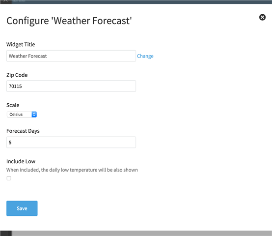
The following Dynamic Configuration exposes configuration options for zip code, scale, forecast days, and low temperature inclusion. Note that resources are used to localize the field names. Also note the min/max rule to restrict forecast days to a maximum of 10.
<propertyGroup id="options" resourceName="Options">
	<property id="fragmentHeader" resourceName="title" dataType="string" defaultValue="${resource:WeatherForecast_Name}" controlType="Telligent.Evolution.Controls.ContentFragmentTokenStringControl, Telligent.Evolution.Controls" />
	<property id="zipCode" resourceName="zipCode" dataType="string" defaultValue="" />
	<property id="scale" resourceName="scale" dataType="string" defaultValue="celsius">
		<propertyValue value="fahrenheit" resourceName="fahrenheit" />
		<propertyValue value="celsius" resourceName="celsius" />
	</property>
	<property id="days" resourceName="days" dataType="int" defaultValue="3">
		<propertyRule type="Telligent.Evolution.Controls.PropertyRules.MinMaxValueRule, Telligent.Evolution.Controls" minValue="1" maxValue="10" />
	</property>
	<property id="includeLow" resourceName="includeLow" descriptionResourceName="includeLowDescription" dataType="bool" defaultValue="true" />
</propertyGroup>
Yields
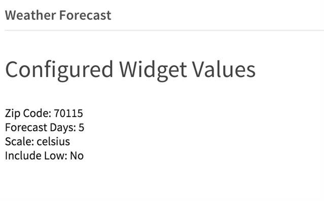
The following sample widget content script reads and simply prints these configuration values. A real implementation would use them against a weather forecast API.
#set ($zipCode = $core_v2_widget.GetStringValue('zipCode', ''))
#set ($days = $core_v2_widget.GetIntValue('days', 3))
#set ($scale = $core_v2_widget.GetStringValue('scale', 'celsius'))
#set ($includeLow = $core_v2_widget.GetBoolValue('includeLow', true))

<ul>
	<li>Zip Code: $zipCode</li>
	<li>Forecast Days: $days</li>
	<li>Scale: $scale</li>
	<li>Include Low: #if($includeLow) Yes #else No #end</li>
</ul>
Yields
The complete example can be downloaded:
<scriptedContentFragments>
	<scriptedContentFragment name="${resource:WeatherForecast_Name}" version="9.0.0.0" description="${resource:WeatherForecast_Description}" instanceIdentifier="c2872c9322ec43d2b1e035f6371ca271" theme="" isCacheable="false" varyCacheByUser="false" showHeaderByDefault="true" cssClass="">
		<contentScript><![CDATA[<h3>Configured Widget Values</h3>

#set ($zipCode = $core_v2_widget.GetStringValue('zipCode', ''))
#set ($days = $core_v2_widget.GetIntValue('days', 3))
#set ($scale = $core_v2_widget.GetStringValue('scale', 'celsius'))
#set ($includeLow = $core_v2_widget.GetBoolValue('includeLow', true))

<ul>
    <li>Zip Code: $zipCode</li>
    <li>Forecast Days: $days</li>
    <li>Scale: $scale</li>
    <li>Include Low: #if($includeLow) Yes #else No #end</li>
</ul>]]></contentScript>
		<headerScript><![CDATA[$core_v2_widget.ApplyTokens($core_v2_widget.GetStringValue('fragmentHeader', '${resource:WeatherForecast_Name}'))]]></headerScript>
		<configuration><![CDATA[<propertyGroup id="options" resourceName="Options">
	<property id="fragmentHeader" resourceName="title" dataType="string" defaultValue="${resource:WeatherForecast_Name}" controlType="Telligent.Evolution.Controls.ContentFragmentTokenStringControl, Telligent.Evolution.Controls" />
	<property id="zipCode" resourceName="zipCode" dataType="string" defaultValue="" />
	<property id="scale" resourceName="scale" dataType="string" defaultValue="celsius">
	    <propertyValue value="fahrenheit" resourceName="fahrenheit" />
	    <propertyValue value="celsius" resourceName="celsius" />
	</property>
	<property id="days" resourceName="days" dataType="int" defaultValue="3">
		<propertyRule type="Telligent.Evolution.Controls.PropertyRules.MinMaxValueRule, Telligent.Evolution.Controls" minValue="1" maxValue="10" />
	</property>
	<property id="includeLow" resourceName="includeLow" descriptionResourceName="includeLowDescription" dataType="bool" defaultValue="true" />
</propertyGroup>
	]]></configuration>
		<languageResources><language key="en-us">
  <resource name="WeatherForecast_Name">Weather Forecast</resource>
  <resource name="days">Forecast Days</resource>
  <resource name="title">Widget Title</resource>
  <resource name="zipCode">Zip Code</resource>
  <resource name="scale">Scale</resource>
  <resource name="fahrenheit">Fahrenheit</resource>
  <resource name="celsius">Celsius</resource>
  <resource name="includeLow">Include Low</resource>
  <resource name="includeLowDescription">When included, the daily low temperature will be also shown</resource>
  <resource name="WeatherForecast_Description">Sample weather widget to demonstrate dynamic configuration</resource>
</language></languageResources>
	</scriptedContentFragment>
</scriptedContentFragments>


