Image sizing in a blog post

Does anyone know how to size images in a blog post properly so that the image does not get cut off in mobile view?

I am specifically talking about images within a blog post and not the Post Image. 

The text seems to wrap in our blog posts in mobile view properly but images are cut off.

See example in mobile: https://community.arm.com/arm-community-blogs/b/graphics-gaming-and-vr-blog/posts/introducing-arm-accuracy-super-resolution 

Parents
  • Hi  

    I agree with Lisa here! Definitely some off behavior in a mobile view!  

    As Lisa mentioned, if you go into the RTE for the blog post and go to Tools --> Source Code --> You could hardcode an image to be set at width 100% so it does not exceed the available space (in desktop and mobile). 

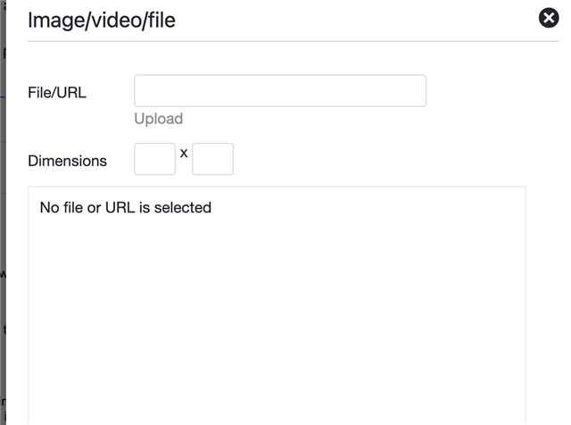
    I also wonder if how the images are being inserted could have an impact. I.e. if an image is uploaded with pre configured dimensions - I would assume it always loads at those dimensions. However, if you insert clear out the dimensions before inserting an image in a Rich Text Editor - it will render at that image size (which may cause it to extend beyond the available space) 

    Example of Clearing Out the Dimensions: 

Reply
  • Hi  

    I agree with Lisa here! Definitely some off behavior in a mobile view!  

    As Lisa mentioned, if you go into the RTE for the blog post and go to Tools --> Source Code --> You could hardcode an image to be set at width 100% so it does not exceed the available space (in desktop and mobile). 

    I also wonder if how the images are being inserted could have an impact. I.e. if an image is uploaded with pre configured dimensions - I would assume it always loads at those dimensions. However, if you insert clear out the dimensions before inserting an image in a Rich Text Editor - it will render at that image size (which may cause it to extend beyond the available space) 

    Example of Clearing Out the Dimensions: 

Children