
Community automatically scales and crops images for specific platform use cases and device display capabilities. This can lead to questions about what image sizes are optimal in different use cases. When considered with the abilities for themes to be configured and customized, there aren't universal answers, though there are general guidelines.
General Guidelines
- When in doubt, always opt for the highest resolution version of an image you can. Do not worry about serving images that are too large, as Community automatically rescales for use case and user device capabilities to provide an optimal presentation.
- When producing new imagery, do not simply measure the pixels an existing image is using in Community by measuring in the browser. Consider that other users will be on different devices with different responsive layouts or pixel ratios which could cause your pixel-perfect image to be presented blurry or cropped.
- Try not to include rendered text within images. This text will be inaccessible, unsearchable, can be blurry for users on devices with different pixel ratios, and can often be completely cropped and unreadable depending on where the image is rendered.
- Try to target a device pixel ratio of at least 2x.
Specific Cases
These dimensions apply only to the default, unmodified, Social Theme included with Community using its default configurations and presume targeting a minimum device pixel ratio of 2x. Lower capability devices will automatically be provided lower resolution versions. All dimensions are in pixels.
Logo
Site Logo as used in the Site Banner
- Dimensions: 250 x 88
- Full left alignment of the contained logo will often work best in its use case.
Email Logo
- Dimensions: 286 x 84
Users
Avatars
- Dimensions: 280 x 280
- User avatars are shown in a variety of scenarios in a variety of sizes. User avatars are typically cropped in a circle by the platform, though they are occasionally still shown as squares with rounded corners.
Cover photos
The optimal size for user cover photos depends on how the "User - Banner" widget is configured. The widget supports three cover layouts:
- Dynamic banner height proportional to the browser width to show a consistent photo at all sizes
- Fixed banner height with photo scaled and cropped to fill the available banner space (default)
- Fixed banner height with entire photo scaled to be visible within the banner space
Depending on the selected layout, the widget also supports different configurable dimensions.
Dynamic banner height proportional to the browser width to show a consistent photo at all sizes:
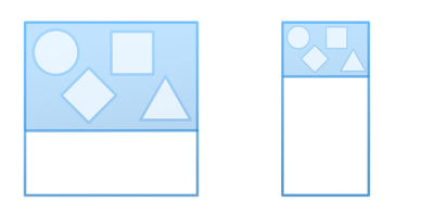
This layout supports dynamically resizing the banner to match the proportions of the cover photo relative to the browser width. This mode is designed for scenarios where a cover photo's content is intended to be pixel-perfect and fully visible at all browser sizes. The trade-off with is that it can result in both very tall banners on wide browsers or illegibly short banners on very narrow phone browsers as it scales the banner's height relative to the browser's width.
The dimensions at which the image will be cropped before being proportionally scaled are configurable, and default to:
- Dynamic banner crop width default configuration: 1500
- Dynamic banner crop height default configuration: 375
- To safely support both high and low DPI screens with this configuration, use an image with dimensions: 3000 x 750.
Fixed banner height with photo scaled and cropped to fill the available banner space:
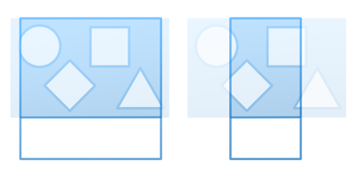
This layout supports configuring the fixed heights of the banner on both profile home pages as well as other non-home pages of a user's profile. By its nature, this layout aggressively scales and crops images to fill the browser width while also matching an exact height. Therefore, there is no specific optimal image size guidance other than to ensure it is at least as tall as the banner's largest configured height, and significantly wider than that configured height (such as by a factor of 10) to account for how this scales. This mode works best with abstract imagery that is not dependent on a user always seeing every pixel.
In this mode, the image is cropped to the following configurable dimensions with a mode of ZoomAndCrop, so it zooms the image enough to fill the entire resulting cropped dimensions before cropping any remainder.
- Banner height on user profile home page default configuration: 176
- Banner height on other user profile pages default configuration: 88
- A good starting point for high-DPI safe images in this configuration is 3520 x 352.
Fixed banner height with entire photo scaled to be visible within the banner space:
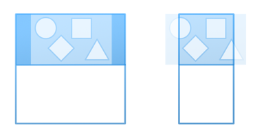
This is similar to the previous mode, except it crops with a ScaleDown mode instead of ZoomAndCrop. This means that it also results in a fixed banner height regardless of browser width, but instead of zooming the contained image to fill the visible area, it shrinks the image so that the image is fully visible at all times within the fixed height. The trade-off is that it can result in letterboxed blank areas to the left and right of the image since the user's browser width and configured banner height will usually not match the same proportion of the image's own dimensions. In this mode, the background of the banner is also configurable to support selecting a color for the visible letterbox bars.
- Banner height on user profile home page default configuration: 176
- Banner height on other user profile pages default configuration: 88
- A good starting point for high-DPI safe images in this configuration is 3520 x 352.
Groups
Banners with Cover Photos
The "Group - Banner" widgets support either color or cover photo design modes. When using cover photos, the optimal size for cover photos depends on how the "Group - Banner" widget is configured. The widget supports three cover layouts:
- Dynamic banner height proportional to the browser width to show a consistent photo at all sizes
- Fixed banner height with photo scaled and cropped to fill the available banner space (default)
- Fixed banner height with entire photo scaled to be visible within the banner space
Depending on the selected layout, the widget also supports different configurable dimensions.
Dynamic banner height proportional to the browser width to show a consistent photo at all sizes:
This layout supports dynamically resizing the banner to match the proportions of the cover photo relative to the browser width. This mode is designed for scenarios where a cover photo's content is intended to be pixel-perfect and fully visible at all browser sizes. The trade-off with is that it can result in both very tall banners on wide browsers or illegibly short banners on very narrow phone browsers as it scales the banner's height relative to the browser's width.
The proportion used can be measured based either on the photo's own dimensions or specified with an explicit crop width and height.
- Dynamic banner height proportions default configuration: Use specific dimensions
- Dynamic banner crop width default configuration: 1500
- Dynamic banner crop height default configuration: 375
- To safely support both high and low DPI screens with this configuration, use an image with dimensions: 3000 x 750.
Fixed banner height with photo scaled and cropped to fill the available banner space:
This layout supports configuring the fixed heights of the banner on both group home pages as well as other non-home pages of a group. By its nature, this layout aggressively scales and crops images to fill the browser width while also matching an exact height. Therefore, there is no specific optimal image size guidance other than to ensure it is at least as tall as the banner's largest configured height, and significantly wider than that configured height (such as by a factor of 10) to account for how this scales. This mode works best with abstract imagery that is not dependent on a user always seeing every pixel.
In this mode, the image is cropped to the following configurable dimensions with a mode of ZoomAndCrop, so it zooms the image enough to fill the entire resulting cropped dimensions before cropping any remainder.
- Banner height on group home page default configuration: 176
- Banner height on other group pages default configuration: 88
- A good starting point for high-DPI safe images in this configuration is 3520 x 352.
Fixed banner height with entire photo scaled to be visible within the banner space:
This is similar to the previous mode, except it crops with a ScaleDown mode instead of ZoomAndCrop. This means that it also results in a fixed banner height regardless of browser width, but instead of zooming the contained image to fill the visible area, it shrinks the image so that the image is fully visible at all times within the fixed height. The trade-off is that it can result in letterboxed blank areas to the left and right of the image since the user's browser width and configured banner height will usually not match the same proportion of the image's own dimensions. In this mode, the background of the banner is also configurable to support selecting a color for the visible letterbox bars.
- Banner height on group home page default configuration: 176
- Banner height on other group pages default configuration: 88
- A good starting point for high-DPI safe images in this configuration is 3520 x 352.
Blogs
Blog Banners with Cover Photos
The "Blog - Banner" widgets support either color or cover photo design modes. When using cover photos, the optimal size for cover photos depends on how the "Blog - Banner" widget is configured. The widget supports three cover layouts:
- Dynamic banner height proportional to the browser width to show a consistent photo at all sizes
- Fixed banner height with photo scaled and cropped to fill the available banner space (default)
- Fixed banner height with entire photo scaled to be visible within the banner space
Depending on the selected layout, the widget also supports different configurable dimensions.
Dynamic banner height proportional to the browser width to show a consistent photo at all sizes:
This layout supports dynamically resizing the banner to match the proportions of the cover photo relative to the browser width. This mode is designed for scenarios where a cover photo's content is intended to be pixel-perfect and fully visible at all browser sizes. The trade-off with is that it can result in both very tall banners on wide browsers or illegibly short banners on very narrow phone browsers as it scales the banner's height relative to the browser's width.
The proportion used can be measured based either on the photo's own dimensions or specified with an explicit crop width and height.
- Dynamic banner height proportions default configuration: Use specific dimensions
- Dynamic banner crop width default configuration: 1500
- Dynamic banner crop height default configuration: 375
- To safely support both high and low DPI screens with this configuration, use an image with dimensions: 3000 x 750.
Fixed banner height with photo scaled and cropped to fill the available banner space:h
This layout supports configuring the fixed height of the banner. By its nature, this layout aggressively scales and crops images to fill the browser width while also matching an exact height. Therefore, there is no specific optimal image size guidance other than to ensure it is at least as tall as the banner's largest configured height, and significantly wider than that configured height (such as by a factor of 10) to account for how this scales. This mode works best with abstract imagery that is not dependent on a user always seeing every pixel.
In this mode, the image is cropped to the following configurable dimensions with a mode of ZoomAndCrop, so it zooms the image enough to fill the entire resulting cropped dimensions before cropping any remainder.
- Banner height default configuration: 176
- A good starting point for high-DPI safe images in this configuration is 3520 x 352.
Fixed banner height with entire photo scaled to be visible within the banner space:
This is similar to the previous mode, except it crops with a ScaleDown mode instead of ZoomAndCrop. This means that it also results in a fixed banner height regardless of browser width, but instead of zooming the contained image to fill the visible area, it shrinks the image so that the image is fully visible at all times within the fixed height. The trade-off is that it can result in letterboxed blank areas to the left and right of the image since the user's browser width and configured banner height will usually not match the same proportion of the image's own dimensions. In this mode, the background of the banner is also configurable to support selecting a color for the visible letterbox bars.
- Banner height default configuration: 176
- A good starting point for high-DPI safe images in this configuration is 3520 x 352.
Post Images
- Dimensions: 2020 x 800
Articles
Category Icons
- Dimensions: 100 x 100
- When possible, pixel-independent SVGs are recommended instead of rendered images.
Featured Content
The "Featured Content Carousel" widget supports either color or cover photo design modes. When using photos, the optimal size for cover photos depends on how the widget is configured. The widget supports two cover photo scaling modes:
- Dynamic carousel height proportional to the browser width to show consistent photos at all sizes
- Fixed carousel height with photos scaled and cropped to fill the available carousel space (default)
Depending on the selected mode, the widget also supports different configurable dimensions.
Dynamic carousel height proportional to the browser width to show consistent photos at all sizes:
This layout supports dynamically resizing the carousel relative to the browser width. The trade-off with is that it can result in both very tall carousels on wide browsers or illegibly short carousels on very narrow phone browsers as it scales the carousel's height relative to the browser's width.
The dimensions at which the photos will be cropped before being proportionally scaled are configurable, and default to:
- Dynamic carousel crop width default configuration: 1500
- Dynamic carousel crop height default configuration: 375
- To safely support both high and low DPI screens with this configuration, use an image with dimensions: 3000 x 750.
Fixed carousel height with photos scaled and cropped to fill the available carousel space:
This layout supports configuring the fixed height of the carousel. By its nature, this layout aggressively scales and crops images to fill the browser width while also matching an exact height. Therefore, there is no specific optimal image size guidance other than to ensure it is at least as tall as the carousel's configured height, and significantly wider than that configured height (such as by a factor of 10) to account for how this scales. This mode works best with abstract imagery that is not dependent on a user always seeing every pixel.
In this mode, the image is cropped to the following configurable dimensions with a mode of ZoomAndCrop, so it zooms the image enough to fill the entire resulting cropped dimensions before cropping any remainder.
- Height default configuration: 315
- A good starting point for high-DPI safe images in this configuration is 3150 x 630.
Achievement Icons
- Dimensions: 64 x 64
- When possible, pixel-independent SVGs are recommended instead of rendered images.