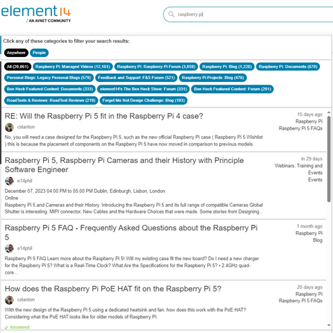
Searching on Community is Poor - How can I Improve This Experience?

I bring up the Community on a mobile device, and I try to search...
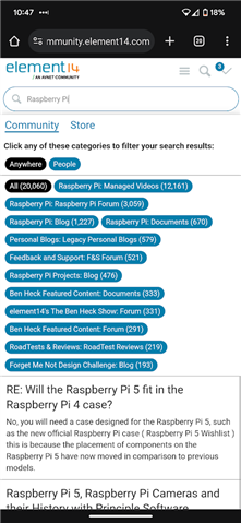
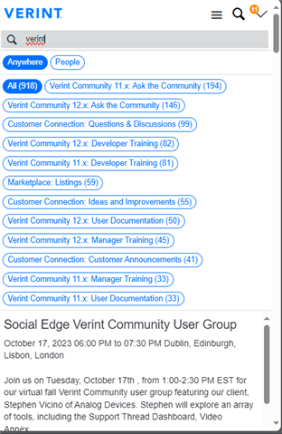
What I get, aren't search results, I get filters, I cannot collapse the filters, I'm sure they may be useful, but what I want are the search results.
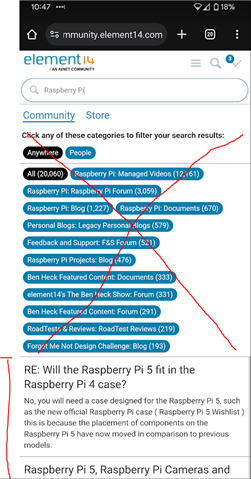
As a user I can't see how to go to 'Advanced' search either, there's no button for it.
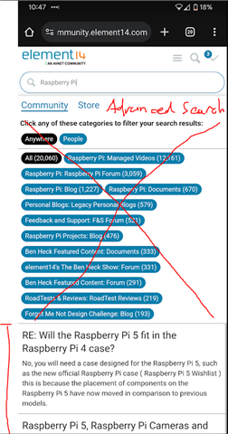
As this is an "out of the box" feature or widget, our dev' team aren't touching it, and so we want a Verint out-of-the-box answer/solution.

Suggestions?

Parents Reply Children
  • There are search results beneath the filters

    I'm glad you can see that's a problem.

    Is there not a way to customise the appearance of these filters? Because the search results are in such a small window here, it's crazy.

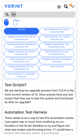
    The problem's the same here too:

    Why can't there be an out-of-the-box solution for this?

    Aren't there implications for customizing an out-of-the-box widget that causes issues when upgrading the platform?

  • You have to modify at least the Css and/or the html, both of which are modifying the widget.  The only implication is the possibility that new items/fixes are added to a widget in an upgrade.  In that case you can choose to revert the widget to the new default, merge the change in to your widget, or if its not relevant to your customization, do nothing and the widget will function as it did before the upgrade.

  • Is there not a way to customise the appearance of these filters? Because the search results are in such a small window here, it's crazy.

      I'm not sure if this would qualify as your "dev team touching this", but I'd think you COULD add an Unfiltered HTML widget on your header with the following code, hide the widget header, and possibly add some other tweaks:

    <style>
        html body .popup-list.search .navigation-list.filter.categories .navigation-item .internal-link {
        min-width: 49%;
        max-width: 49%;
        height: 4em;
        line-height: 1.5em;
        font-size: 0.6em;
        margin: 2px 1px;
        padding: 1px 2px;
        }
    </style>

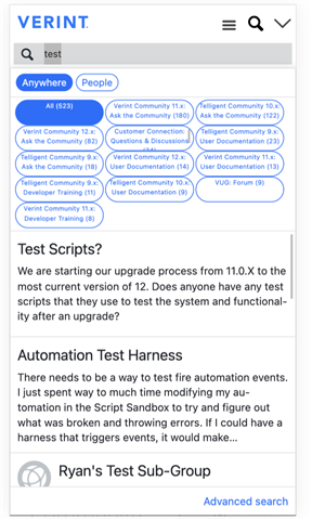
    Doing this on this site resulted in:

    Changing the heights in the CSS to 32% results in: 

    It needs a little more work but saves real estate on the page. I'm also not sure if you'll get mobile alerts from Google Search Console that the elements are too close together, but could be worth a shot depending on your needs. 

    I know I'm a little more into hacks/workarounds than you are, so I'm not sure if you're okay with this kind of change, but I hope it possibly spawns some ideas Slight smile

    Edit: I forgot to add some @media breakpoints into the code above, e.g https://www.w3schools.com/css/css_rwd_mediaqueries.asp, as that would probably be needed

  • Thanks  , I appreciate anyone spending time to have input on this Slight smile

    What is needed is something far more drastic.

    Consider that the public coming to the site and searching for what they're looking for, may be entirely new to Verint and how it works. They don't care about the difference between 'blogs' and 'documents', they simply want an answer to their question, or to find information. They don't necessarily want or care about filters.

    So let's remove it.

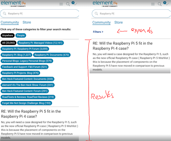
    In this concept, we have a lot more room for the results, and we collapse the filters, with the ability for them to expand if necessary. This way we don't have people bouncing off the site for not being able to find their results.

    For comparison from the desktop view, here is at least how many results could be shown in that initial result space: