Theme Options > Layout - Different options for header and content

We received a somewhat unique request to try and replicate a "Full-Screen Experience" within blog posts for external content. 

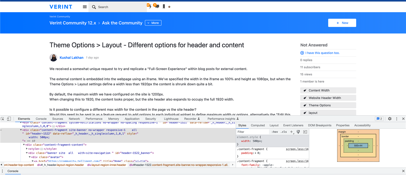
The external content is embedded into the webpage using an iframe. We've specified the width in the iframe as 100% and height as 1080px, but when the Theme Options > Layout settings define a width less than 1920px the content is shrunk down quite a bit. 

By default, the maximum width we have configured on the site is 1200px. 
When changing this to 1920, the content looks proper, but the site header also expands to occupy the full 1920 width.

Is it possible to configure a different max width for the content in the page vs the site header? 
Would this need to be sent in as a feature request to add options to each individual widget to define maximum width or options, alternatively the "Edit this Page > Layout" options?

Parents
  •  You might be able to target the header by injecting some custom CSS into an Unfiltered HTML widget within your Blog's theme. For example, using this community:

    Once you know the correct CSS class(es), add something like:

    <style>
    html body .element .element_1 {
        property: value;
        }
    </style>

    This should override any of your site's default CSS, but you may need to trial & error some changes to your code to make this work.

  • Are you trying to blow out the margins on a specific blog?  We've done it here with a custom less file in our theme, then we dynamically add it to the header via the "HeadScripts" area in the theme when the blog in question is loaded.

    Here is a link to our blog that blows out the margins to have a 100% width for one zone on the layout.
    https://www.hearingfirst.org/b/blog 

Reply Children