How to initialize a Navigation List

Hello,

I'm trying to build a navigation list in a widget so that it's mobile friendly.  I see that the HTML structure of other components looks like:

<div id="mobile-dashboard-ui-links" class="navigation-list new">
    <div data-direction="vertical" data-maxlinks="50" data-minlinks="0">
        <div class="container">
            <ul>
                <li class="navigation-list-item">
                    <a class="" href="#">Foo</a>
                </li>
                <li class="navigation-list-item">
                    <a class="" href="#">Bar</a>
                </li>
                <li class="navigation-list-item">
                    <a class="" href="#">Baz</a>
                </li>
            </ul>
        </div>
    </div>
</div>

When it renders on mobile (and the user clicks on its UI control) I expect it to render a selection list from the bottom up, consistent with other components in Verint:

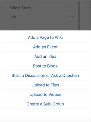
However, when it renders it doesn't initialize properly, despite having the navigation-list and navigation-list-item classes.  How can I initialize a navigation list correctly?

Chris

Parents
  • Hi .  I'd recommend having a look at the  links UI Component . This is the UI API which supports all of the collapsing lists of links in the UI, and it automatically renders overflowed links as a pop-up on desktop or sheet on mobile. The HTML structure you posted is close, but it's the output of the UI component, and not the source HTML it needs in order to initiate. That would closer to:

    <div id="mobile-dashboard-ui-links" class="ui-links" data-maxlinks="50" data-minlinks="0">
    	<ul>
    		<li><a href="#">Foo</a></li>
    		<li><a href="#">Bar</a></li>
    		<li><a href="#">Baz</a></li>
            <li><a href="#" data-more>More</a></li>
            <li><a href="#" data-cancel>Cancel</a></li>
    	</ul>
    </div>

    Three key things to note are the use of "ui-links" class, which triggers the ui component, as well as the "More" and "Cancel" links, which are rendered only when needed by the component. The use of other classes like navigation-list or navigation-list-item is completely arbitrary. 

    It's also worth noting that this can render horizontally, vertically, or both. For example, the following with a configuration of horizontal and "data-maxlinks" constraint of 2 will render a horizontal list of "Foo", "Bar", "More", where "More" opens a pop-up (or sheet if on mobile) with "Baz", "Ham", "Eggs", and "Cancel".

    <div id="mobile-dashboard-ui-links" class="ui-links" data-direction="horizontal" data-maxlinks="2" data-minlinks="0">
    	<ul>
    		<li><a href="#">Foo</a></li>
    		<li><a href="#">Bar</a></li>
    		<li><a href="#">Baz</a></li>
    		<li><a href="#">Ham</a></li>
    		<li><a href="#">Eggs</a></li>
            <li><a href="#" data-more>More</a></li>
            <li><a href="#" data-cancel>Cancel</a></li>
    	</ul>
    </div>

    And if the data-maxlinks and/or the horizontal space of the links takes up more space than is available on a layout (desktop or mobile) it will automatically collapse the remaining links behind "More" to show as a pop-up or sheet.

    Hope this helps!

Reply
  • Hi .  I'd recommend having a look at the  links UI Component . This is the UI API which supports all of the collapsing lists of links in the UI, and it automatically renders overflowed links as a pop-up on desktop or sheet on mobile. The HTML structure you posted is close, but it's the output of the UI component, and not the source HTML it needs in order to initiate. That would closer to:

    <div id="mobile-dashboard-ui-links" class="ui-links" data-maxlinks="50" data-minlinks="0">
    	<ul>
    		<li><a href="#">Foo</a></li>
    		<li><a href="#">Bar</a></li>
    		<li><a href="#">Baz</a></li>
            <li><a href="#" data-more>More</a></li>
            <li><a href="#" data-cancel>Cancel</a></li>
    	</ul>
    </div>

    Three key things to note are the use of "ui-links" class, which triggers the ui component, as well as the "More" and "Cancel" links, which are rendered only when needed by the component. The use of other classes like navigation-list or navigation-list-item is completely arbitrary. 

    It's also worth noting that this can render horizontally, vertically, or both. For example, the following with a configuration of horizontal and "data-maxlinks" constraint of 2 will render a horizontal list of "Foo", "Bar", "More", where "More" opens a pop-up (or sheet if on mobile) with "Baz", "Ham", "Eggs", and "Cancel".

    <div id="mobile-dashboard-ui-links" class="ui-links" data-direction="horizontal" data-maxlinks="2" data-minlinks="0">
    	<ul>
    		<li><a href="#">Foo</a></li>
    		<li><a href="#">Bar</a></li>
    		<li><a href="#">Baz</a></li>
    		<li><a href="#">Ham</a></li>
    		<li><a href="#">Eggs</a></li>
            <li><a href="#" data-more>More</a></li>
            <li><a href="#" data-cancel>Cancel</a></li>
    	</ul>
    </div>

    And if the data-maxlinks and/or the horizontal space of the links takes up more space than is available on a layout (desktop or mobile) it will automatically collapse the remaining links behind "More" to show as a pop-up or sheet.

    Hope this helps!

Children