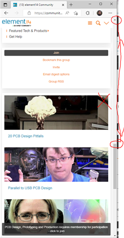
How do you prioritise the order of a widget when it's being shown 'only in single column mode' ?

I'm editing the layout of a page in v11 of verint.

I have a bunch of widgets on a group page.

I want to specify the order of the widgets, but due to the nature of one of the widgets not being suitable for mobile responsive view, aka single column mode, I need to have two widgets showing the same thing, but one setup for mobile view, and one not (let's go with this rather than designing one widget to be suitable for both views for now)

On the widget, I can only choose one of these options:
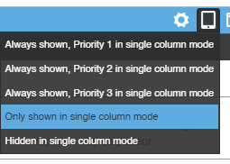
Either it's only shown in single column mode, hidden in single column mode, or it's 'always shown, priority x in single column mode'

The problem is, I want:

'Only shown in single column mode, priority 1 in single column mode'

Because otherwise, when it's 'only shown in single column mode' everything else set with a priority takes... well, priority, but the equivalent widget for this 'single column mode' widget, in non single column mode, is at the top of the page, but this, still gets dumped to the bottom.
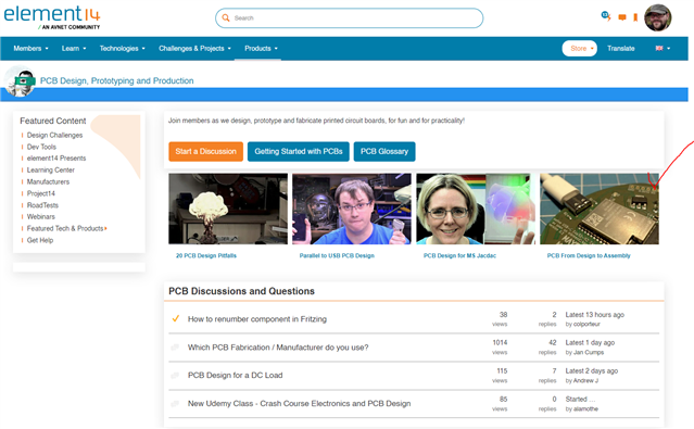
What're my options?

Parents
  • Could you customize the Theme and a new set of wrapping formats and then use the classes to hide and show widgets depending on media queries?

  • I'm not sure I follow, but this would be better handled via widget control due to the different knowledge/experience levels of those who have the permission(s) to change the layouts.

  • This would be done via widget control, the theme defines the options in the widget dropdowns.

  • Hi Christopher 

    So in the theme editor there is a section called "Body Script", you would need to do this for all themes (site, group and apps)

    In this file you will see the ootb wrapping options (the other selector in the widget header)

    #set ($minWidthUnit = $core_v2_theme.GetUnitValue('minWidth', '670px', 10))
    #set ($minWidth = $core_v2_utility.ParseInt($core_v2_utility.Replace($minWidthUnit, 'px', '')))
    
    
    #set ($wrappingFormats = [])
    #set ($ignore = $wrappingFormats.Add("%{Name=$core_v2_language.GetResource('WrappingFormat-NoBorderWithNoSpacing'),CssClass='no-wrapper',IncludeHeader='false'}"))
    #set ($ignore = $wrappingFormats.Add("%{Name=$core_v2_language.GetResource('WrappingFormat-NoBorderWithSpacing'),CssClass='no-wrapper with-spacing',IncludeHeader='false'}"))
    #set ($ignore = $wrappingFormats.Add("%{Name=$core_v2_language.GetResource('WrappingFormat-NoBorderWithSpacingAndHeader'),CssClass='no-wrapping with-spacing with-header',IncludeHeader='true'}"))
    #set ($ignore = $wrappingFormats.Add("%{Name=$core_v2_language.GetResource('WrappingFormat-TopBorder'),CssClass='top-border with-spacing',IncludeHeader='false'}"))
    #set ($ignore = $wrappingFormats.Add("%{Name=$core_v2_language.GetResource('WrappingFormat-TopBorderAndHeader'),CssClass='top-border with-spacing with-header',IncludeHeader='true'}"))
    
    #set ($options = "%{ WrappingFormats = $wrappingFormats, DefaultWrappingFormatWithHeader = 'top-border with-spacing with-header reponsive-1', DefaultWrappingFormatWithoutHeader = 'no-wrapper responsive-1', LayoutReflowMinWidth = $minWidth }")
    
    $context_v2_themeBody.RenderHeader($options)
    $context_v2_themeBody.RenderPage($options)
    $context_v2_themeBody.RenderFooter($options)

    You can create duplicates of the ones you use and add the extra tags such a responsive into the class

    So for example 2 entries for no border with spacing but also with responsive elements 

    #set ($priority1 = " (priority 1)")
    #set ($priority2 = " (priority 2)")

    #set ($ignore = $wrappingFormats.Add("%{Name=$core_v2_language.GetResource('WrappingFormat-NoBorderWithSpacing')$priority1,CssClass='no-wrapper with-spacing responsive-1',IncludeHeader='false'}"))


    #set ($ignore = $wrappingFormats.Add("%{Name=$core_v2_language.GetResource('WrappingFormat-NoBorderWithSpacing')$priority2,CssClass='no-wrapper with-spacing responsive-2',IncludeHeader='false'}"))

    Once added 

    When you use the page editor you will now see 2 new options 


    In essence all these options do is add classes to the widget when rendered on the page so you could also add other custom classes if required

    Obviously it would be better if you could just extend the responsive options as you can the wrapping ones but this is a clean work around

  • Thanks, I'll have to see if the dev's consider it a clean workaround and if it's persistable between site upgrades.

  • Thanks for this, it looked quite promising. Unfortunately there are side effects in the Responsive format menu, where it ends up looking like you have 2 options selected at once;

    Ideally, this is an option we'd love to have added to the core platform & would live in the Responsive Behaviour menu.

  • How have you defined the new wrapping formats ? 


  • I copied and pasted the lines from your example.

  • Ideally, this is an option we'd love to have added to the core platform & would live in the Responsive Behaviour menu

    Yes, the menu options here should govern "cssClassAddition"

    These are the parameters you have to edit/insert in manually but they should really be handled by the GUI:

    responsive-shown responsive-1 ("Only shown in single column mode, Priority 1 in single column mode")
    responsive-shown responsive-2 ("Only shown in single column mode, Priority 2 in single column mode")
    responsive-shown responsive-3 ("Only shown in single column mode, Priority 3 in single column mode")

    At the moment you have to export the XML of the theme, edit them manually and then re-import the XML of the theme.

Reply
  • Ideally, this is an option we'd love to have added to the core platform & would live in the Responsive Behaviour menu

    Yes, the menu options here should govern "cssClassAddition"

    These are the parameters you have to edit/insert in manually but they should really be handled by the GUI:

    responsive-shown responsive-1 ("Only shown in single column mode, Priority 1 in single column mode")
    responsive-shown responsive-2 ("Only shown in single column mode, Priority 2 in single column mode")
    responsive-shown responsive-3 ("Only shown in single column mode, Priority 3 in single column mode")

    At the moment you have to export the XML of the theme, edit them manually and then re-import the XML of the theme.

Children
No Data