
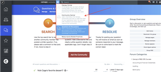 The default background for the hamburger menu is white. We'd like to change that to #cccccc or something similar.
Where can I update the existing CSS to change that?
The default background for the hamburger menu is white. We'd like to change that to #cccccc or something similar.
Where can I update the existing CSS to change that?


I've overwritten it before using CSS but I think you're trying to change the styling already there which I believe would mean changing the format-popup-ist.less file.
I would recommend overriding. Makes it easier to upgrade in the future
I looked at all the code in that .less file that Drew Nixon provided and can't figure out what I should change!
@color-background seems to be the variable that's being used. how do I target all the @color-background parts of the .popup-list .
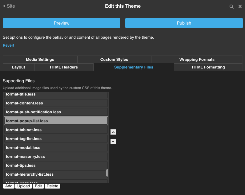
Here's the full code of that format-popup-list.less file. What should I put into a custom override CSS file, and where should I put the override CSS file so that the system looks at my override file instead of the default system CSS?
/* read list */
.popup-list.notification {
	border-radius: 0 0 3px 3px;
	overflow: hidden;
	.message {
		background-color: @color-foreground;
		opacity: .85;
		color: @color-background;
		margin: 0;
		font-family: @font-family;
		font-weight: @font-weight;
		font-size: @font-size;
		padding: (@spacing * 2) (@spacing * 3) (@spacing * 2) (@spacing * 3);
		.transition(background-color .3s);
		&.error {
			background-color: @color-attention;
			opacity: .95;
		}
	}
}

.popup-list-content-item, .popup-list-content-item-header {
	padding: (@spacing / 2) @spacing (@spacing / 2) 7px;
	border-top: 0px;
	border-bottom: 1px solid lighten(@color-chrome, 15%);
	cursor: pointer;
	position: relative;
	overflow: hidden;

	&:last-child {
		border-bottom: 0px;
	}
}

.popup-list-content-item-header {
	background-color: lighten(@color-chrome, 15%);
	.name {
		font-weight: 600;
	}
}

.popup-list-content-item {
	padding-bottom: @spacing;
	padding-left: 50px;
	min-height: 51px;
	&.no-author {
		padding-left: 7px;
	}
	&:hover, &.selected {
		background-color: @color-accent;
		color: fade(@color-background, 90%);
		.description,
		.post-date,
		.post-like {
			color: fade(@color-background, 50%);
		}
		a {
			color: @color-background !important;
		}
	}
	.user-name {
		display: none;
	}
	.avatar {
		position: absolute;
		top: 5px;
		left: 5px;
		overflow: hidden;
		.round;
		img {
			.round;
		}
	}
	.description,
	.post-date,
	.post-like {
		padding: 0px;
		margin: 0px 10px 0px 0px;
		float: left;
		line-height: 1.3em;
		font-size: @font-size * .8;
		color: @color-chrome;
	}
}

.popup-list {
	font-family: @font-family;
	font-weight: @font-weight;
	font-size: @font-size * 0.9;
	border: 0px;
	background-color: transparent;
	-ms-touch-action: none;
	touch-action: none;
	.popup-border;
	background-color: @color-background;
	border-radius: 3px;
	&[data-position="downright"] {
		border-top-left-radius: 0;
	}
	&[data-position="upright"] {
		border-bottom-left-radius: 0;
	}
	&[data-position="downleft"] {
		border-top-right-radius: 0;
	}
	&[data-position="upleft"] {
		border-bottom-right-radius: 0;
	}
	.multiple-column-list {
	}
	.content-list {
		width: 280px;
		overflow: auto;
		-webkit-overflow-scrolling: touch;
	}
	.navigation-list.filter {
		border-bottom: 1px solid lighten(@color-chrome, 15%);
		overflow: hidden;
		padding: 3px 6px;
		.navigation-item {
			display: inline;
			.internal-link {
				min-width: 40px;
				text-align: center;
				font-size: .9em;
				border-radius: 50px;
				float: left;
				margin: 4px 2px;
				padding: 2px 7px;
				text-decoration: none;
				border: 1px solid @color-accent;
				&:hover {
					background-color: lighten(@color-accent, 5%);
					border: 1px solid lighten(@color-accent, 5%);
					color: @color-background;
				}
				&.selected {
					background-color: @color-accent;
					color: @color-background;
				}
			}
		}
	}
	&.bookmarks, &.notifications, &.conversations, &.user, &.site {
		.content-list {
			.content-item {
				.popup-list-content-item;

				.post-authors {
					font-weight: 600;
				}
			}
			.content-item-header {
				.popup-list-content-item-header;
			}
		}

		.content-list .content-item .content-group a {
			padding: 0px;
			margin: 0px 10px 0px 0px;
			float: left;
			line-height: 1.3em;
			font-size: .9em;
		}
		.user {
			min-height: 60px;
			border-bottom: 1px solid lighten(@color-chrome, 15%);
			position: relative;
			display: flex;
			flex-direction: row;
			justify-content: flex-start;
			align-items: center;
			padding: @spacing;
			> div {
				display: flex;
				flex-direction: row;
				align-items: center;
			}
			.avatar {
				.round;
				img {
					.round;
				}
				margin-right: @spacing;
			}
			.user-name {
				font-size: @font-size * 1.1;
			}
			.oauth-provider {
				position: absolute;
				top: 0;
				left: 0;
			}

			&.navigation-list {
				display: block;
			}

			&.with-cover-photo {
				align-items: flex-end;
				height: 120px;
				border-bottom: 0px;
				background-size: 100% 100%;
				background-repeat: no-repeat;
				background-position: center;

				.avatar {
					border: 2px solid @color-background;;
				}
				.user-name,
				.user-name a {
					color: @color-background;
					text-shadow: 0px 0px 7px rgba(0,0,0,1);
				}
			}
		}
		.navigation-list.user {
			padding: @spacing;
		}

		/* read list notification preference */
		.notification-preference {
			background-color: @color-background;
			color: @color-foreground;
			&:hover {
				color: @color-foreground;
			}
			.description {
				float: left !important;
				width: 60% !important;
				padding: 6px 8px 8px 8px !important;
				color: @color-foreground !important;
			}
			.button {
				background-color: @color-accent;
				color: @color-background;
				border-radius: 3px 3px 3px 3px;
				display: block;
				float: right;
				margin: 4px 4px 0;
				padding: 3px;
				text-align: center;
				text-decoration: none;
				width: 60px;
				font-size: .8em;
				&:hover {
					background-color: lighten(@color-accent, 5%);
				}
				&.cancel {
					background-color: @color-chrome;
					&:hover {
						background-color: lighten(@color-chrome, 5%);
					}
				}
			}
		}
		.mark,
		.preference {
			position: absolute;
			top: 3px;
			right: 5px;
			display: none;
			a {
				.replace_with_icon(@cancel-squared);
			}
		}
		.content-item .mark {
			top: 23px;
			a {
				.replace_with_icon(@check);
			}
		}
		.content-item-header:hover .mark {
			display: block;
			top: 5px;
			a {
				.replace_with_icon(@check);
			}
		}
		.content-item:hover {
			.mark,
			.preference {
				display: block;
			}
		}
	}
	.loading {
		min-height: 20px;
		padding: @spacing;
		text-align: center;
		font-style: italic;
		background-color: contrast(@color-foreground, darken(@color-foreground, 87%), lighten(@color-foreground, 87%));
		color: lighten(@color-foreground, 30%);
		border: 0px;
		width: 280px;
	}
	&.composer-suggestion-selector {
		.loading {
			width: 100%;
			position: static;
			background-color: transparent;
		}
	}
	.content-list-footer {
		min-height: 20px;
		border-top: 1px solid lighten(@color-chrome, 15%);
		padding: @spacing;
		overflow: hidden;
		.right {
			float: right;
		}
		.left {
			float: left;
		}
	}
	.message.norecords {
		border: 0px;
		padding: @spacing;
		margin: 0px;
		font-size: @font-size * .9;
	}

	&.search {
		padding-top: 0px;
		.loading {
			width: 100%;
		}
		.multiple-column-list {
			position: relative;
			top: 0px;
			.content-list.content {
				.content-item {
					padding: 0;
					margin: 0;
					.content.abbreviated {
						margin: 0;
						font-size: @font-size * .9;
						padding: @spacing;
						cursor: pointer;
						> .avatar {
							img {
								width: 44px !important;
								height: 44px !important;
							}
						}
						> .summary {
							.name {
								font-size: @font-size * 1.5;
								margin-bottom: @spacing * (2 / 3);
							}
							.author {
								a {
									color: contrast(@color-foreground, darken(@color-foreground, 50%), lighten(@color-foreground, 50%));
								}
								margin-bottom: @spacing * (2 / 3);
							}
							.content {
								font-size: @font-size * .9;
							}
						}
						> .attributes {
							font-size: @font-size * .9;
							a {
								color: @color-foreground;
							}
						}
					}
					&:hover, &.selected {
						background-color: @color-accent;
						color: @color-background;
						a {
							color: @color-background;
						}
						.content.abbreviated {
							> .summary {
								.author {
									a {
										color: @color-background;
									}
								}
							}
							> .attributes {
								color: @color-background;
								a {
									color: @color-background;
								}
							}
						}
					}
				}
			}
		}
	}
	&.without-avatar {
		.content-list {
			.content-item {
				padding: @spacing;
				min-height: 0px;
			}
		}
	}
}
I looked at all the code in that .less file that Drew Nixon provided and can't figure out what I should change!
@color-background seems to be the variable that's being used. how do I target all the @color-background parts of the .popup-list .
Here's the full code of that format-popup-list.less file. What should I put into a custom override CSS file, and where should I put the override CSS file so that the system looks at my override file instead of the default system CSS?
/* read list */
.popup-list.notification {
	border-radius: 0 0 3px 3px;
	overflow: hidden;
	.message {
		background-color: @color-foreground;
		opacity: .85;
		color: @color-background;
		margin: 0;
		font-family: @font-family;
		font-weight: @font-weight;
		font-size: @font-size;
		padding: (@spacing * 2) (@spacing * 3) (@spacing * 2) (@spacing * 3);
		.transition(background-color .3s);
		&.error {
			background-color: @color-attention;
			opacity: .95;
		}
	}
}

.popup-list-content-item, .popup-list-content-item-header {
	padding: (@spacing / 2) @spacing (@spacing / 2) 7px;
	border-top: 0px;
	border-bottom: 1px solid lighten(@color-chrome, 15%);
	cursor: pointer;
	position: relative;
	overflow: hidden;

	&:last-child {
		border-bottom: 0px;
	}
}

.popup-list-content-item-header {
	background-color: lighten(@color-chrome, 15%);
	.name {
		font-weight: 600;
	}
}

.popup-list-content-item {
	padding-bottom: @spacing;
	padding-left: 50px;
	min-height: 51px;
	&.no-author {
		padding-left: 7px;
	}
	&:hover, &.selected {
		background-color: @color-accent;
		color: fade(@color-background, 90%);
		.description,
		.post-date,
		.post-like {
			color: fade(@color-background, 50%);
		}
		a {
			color: @color-background !important;
		}
	}
	.user-name {
		display: none;
	}
	.avatar {
		position: absolute;
		top: 5px;
		left: 5px;
		overflow: hidden;
		.round;
		img {
			.round;
		}
	}
	.description,
	.post-date,
	.post-like {
		padding: 0px;
		margin: 0px 10px 0px 0px;
		float: left;
		line-height: 1.3em;
		font-size: @font-size * .8;
		color: @color-chrome;
	}
}

.popup-list {
	font-family: @font-family;
	font-weight: @font-weight;
	font-size: @font-size * 0.9;
	border: 0px;
	background-color: transparent;
	-ms-touch-action: none;
	touch-action: none;
	.popup-border;
	background-color: @color-background;
	border-radius: 3px;
	&[data-position="downright"] {
		border-top-left-radius: 0;
	}
	&[data-position="upright"] {
		border-bottom-left-radius: 0;
	}
	&[data-position="downleft"] {
		border-top-right-radius: 0;
	}
	&[data-position="upleft"] {
		border-bottom-right-radius: 0;
	}
	.multiple-column-list {
	}
	.content-list {
		width: 280px;
		overflow: auto;
		-webkit-overflow-scrolling: touch;
	}
	.navigation-list.filter {
		border-bottom: 1px solid lighten(@color-chrome, 15%);
		overflow: hidden;
		padding: 3px 6px;
		.navigation-item {
			display: inline;
			.internal-link {
				min-width: 40px;
				text-align: center;
				font-size: .9em;
				border-radius: 50px;
				float: left;
				margin: 4px 2px;
				padding: 2px 7px;
				text-decoration: none;
				border: 1px solid @color-accent;
				&:hover {
					background-color: lighten(@color-accent, 5%);
					border: 1px solid lighten(@color-accent, 5%);
					color: @color-background;
				}
				&.selected {
					background-color: @color-accent;
					color: @color-background;
				}
			}
		}
	}
	&.bookmarks, &.notifications, &.conversations, &.user, &.site {
		.content-list {
			.content-item {
				.popup-list-content-item;

				.post-authors {
					font-weight: 600;
				}
			}
			.content-item-header {
				.popup-list-content-item-header;
			}
		}

		.content-list .content-item .content-group a {
			padding: 0px;
			margin: 0px 10px 0px 0px;
			float: left;
			line-height: 1.3em;
			font-size: .9em;
		}
		.user {
			min-height: 60px;
			border-bottom: 1px solid lighten(@color-chrome, 15%);
			position: relative;
			display: flex;
			flex-direction: row;
			justify-content: flex-start;
			align-items: center;
			padding: @spacing;
			> div {
				display: flex;
				flex-direction: row;
				align-items: center;
			}
			.avatar {
				.round;
				img {
					.round;
				}
				margin-right: @spacing;
			}
			.user-name {
				font-size: @font-size * 1.1;
			}
			.oauth-provider {
				position: absolute;
				top: 0;
				left: 0;
			}

			&.navigation-list {
				display: block;
			}

			&.with-cover-photo {
				align-items: flex-end;
				height: 120px;
				border-bottom: 0px;
				background-size: 100% 100%;
				background-repeat: no-repeat;
				background-position: center;

				.avatar {
					border: 2px solid @color-background;;
				}
				.user-name,
				.user-name a {
					color: @color-background;
					text-shadow: 0px 0px 7px rgba(0,0,0,1);
				}
			}
		}
		.navigation-list.user {
			padding: @spacing;
		}

		/* read list notification preference */
		.notification-preference {
			background-color: @color-background;
			color: @color-foreground;
			&:hover {
				color: @color-foreground;
			}
			.description {
				float: left !important;
				width: 60% !important;
				padding: 6px 8px 8px 8px !important;
				color: @color-foreground !important;
			}
			.button {
				background-color: @color-accent;
				color: @color-background;
				border-radius: 3px 3px 3px 3px;
				display: block;
				float: right;
				margin: 4px 4px 0;
				padding: 3px;
				text-align: center;
				text-decoration: none;
				width: 60px;
				font-size: .8em;
				&:hover {
					background-color: lighten(@color-accent, 5%);
				}
				&.cancel {
					background-color: @color-chrome;
					&:hover {
						background-color: lighten(@color-chrome, 5%);
					}
				}
			}
		}
		.mark,
		.preference {
			position: absolute;
			top: 3px;
			right: 5px;
			display: none;
			a {
				.replace_with_icon(@cancel-squared);
			}
		}
		.content-item .mark {
			top: 23px;
			a {
				.replace_with_icon(@check);
			}
		}
		.content-item-header:hover .mark {
			display: block;
			top: 5px;
			a {
				.replace_with_icon(@check);
			}
		}
		.content-item:hover {
			.mark,
			.preference {
				display: block;
			}
		}
	}
	.loading {
		min-height: 20px;
		padding: @spacing;
		text-align: center;
		font-style: italic;
		background-color: contrast(@color-foreground, darken(@color-foreground, 87%), lighten(@color-foreground, 87%));
		color: lighten(@color-foreground, 30%);
		border: 0px;
		width: 280px;
	}
	&.composer-suggestion-selector {
		.loading {
			width: 100%;
			position: static;
			background-color: transparent;
		}
	}
	.content-list-footer {
		min-height: 20px;
		border-top: 1px solid lighten(@color-chrome, 15%);
		padding: @spacing;
		overflow: hidden;
		.right {
			float: right;
		}
		.left {
			float: left;
		}
	}
	.message.norecords {
		border: 0px;
		padding: @spacing;
		margin: 0px;
		font-size: @font-size * .9;
	}

	&.search {
		padding-top: 0px;
		.loading {
			width: 100%;
		}
		.multiple-column-list {
			position: relative;
			top: 0px;
			.content-list.content {
				.content-item {
					padding: 0;
					margin: 0;
					.content.abbreviated {
						margin: 0;
						font-size: @font-size * .9;
						padding: @spacing;
						cursor: pointer;
						> .avatar {
							img {
								width: 44px !important;
								height: 44px !important;
							}
						}
						> .summary {
							.name {
								font-size: @font-size * 1.5;
								margin-bottom: @spacing * (2 / 3);
							}
							.author {
								a {
									color: contrast(@color-foreground, darken(@color-foreground, 50%), lighten(@color-foreground, 50%));
								}
								margin-bottom: @spacing * (2 / 3);
							}
							.content {
								font-size: @font-size * .9;
							}
						}
						> .attributes {
							font-size: @font-size * .9;
							a {
								color: @color-foreground;
							}
						}
					}
					&:hover, &.selected {
						background-color: @color-accent;
						color: @color-background;
						a {
							color: @color-background;
						}
						.content.abbreviated {
							> .summary {
								.author {
									a {
										color: @color-background;
									}
								}
							}
							> .attributes {
								color: @color-background;
								a {
									color: @color-background;
								}
							}
						}
					}
				}
			}
		}
	}
	&.without-avatar {
		.content-list {
			.content-item {
				padding: @spacing;
				min-height: 0px;
			}
		}
	}
}
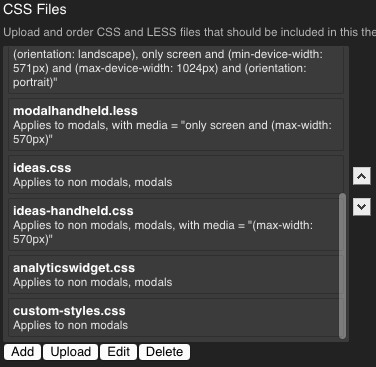
I just add a "custom-styles.css" file in the HTML headers for the site theme and overwrite the styles using !important if you need to. Not sure if this is the best way but it may make it easiest when upgrading as Luke said.
Then you could just add:
.popup-list.site {
    background: #3956db;
}
Drew Nixon This is exactly what I was looking for. I also appreciate Luke R Davidson idea to add all of this as an override.
I created a tutorial video for anyone interested and needing to see the step-by-step on how to override not just the background color, but also how to find the different element names to target styling overrides...
I took our navigation bar from...
 ➞ ➞ to ➞ ➞
Here's a video that shows detail for detail how I customized our popup menu... 
︎
Looks great!
That means a lot, Drew! (Coming from the guy who taught me everything i know about this! 