Verint Community adjusts the existing page using responsive and adaptive techniques to present the same content to desktop browsers, tablets, and handheld devices. These adjustments include stylistic changes, behavior adjustments, functionality adjustments, and content reflowing.
Stylistic Changes
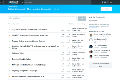
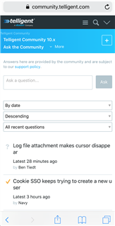
The default theme for Verint Community includes responsive adjustments to some widgets via the handheld.less stylesheet and media-query-based overrides for specific widgets. These changes may rearrange content for smaller devices or text size or spacing adjustments. An example of this is the Forum Thread List widget that adjusts the amount of information shown and the layout of listed threads between large browsers and small browsers:
Behavior Changes
For small screens and touch-focused devices, some behaviors of the community require adjustment, for example:
Opening the Management Menu
On very small screens, the pencil icon to access the management panel is removed in favor of a left-to-right swipe gesture.
Removal of Hover-over Behaviors
On touch-enabled devices, the checkmark icons to mark notifications as read on the Notification List widget are always shown whereas on non-touch devices, they are only shown when hovering over the notification.
Condensing of the Site, Group, and Blog Banners
On small screens, the Site Banner widget adjusts significantly to condense the navigation menu, search, and user-related links on a single line:

Adjustment of Drop-Down List Value Selection
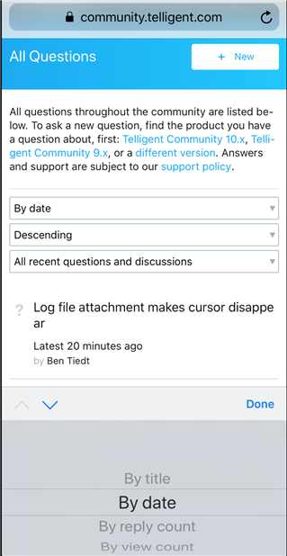
Drop-down lists that are styled show more natively on handheld devices to leverage the device's handling of item selection:
Menu/Link Overflow Pop-ups
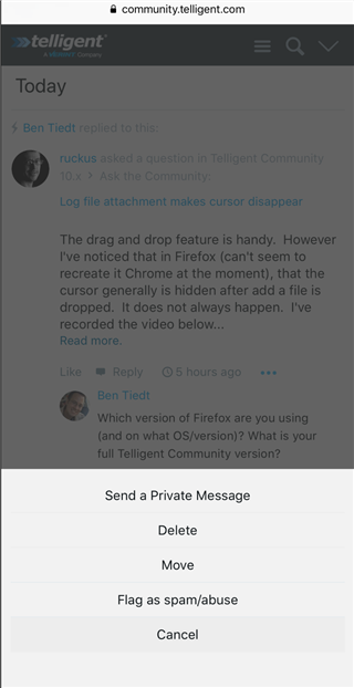
On small devices, menu overflows are rendered as pop-up menus from the bottom of the devices, instead of menus opening from the More or ... options:
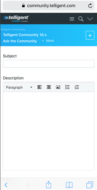
Simplification of the Editor
Because handheld devices' browsers don't handle selection well, the editor is simplified to expose paragraph-level configuration options only. Also, because emoji keyboards are more easily accessible, emoticon selection favors the native emoji keyboard:
Functionality Adjustments
Some functionality adjusts as well. For example, the editor provides slightly fewer options on touch-enabled devices to prevent the toolbar from being overloaded with toolbars. Also, the ability to search within document preview is removed on small screen devices.
Content Reflowing
On small screen devices, the multi-column layout supported for large devices is reflowed into a single column to prevent horizontal scrollbars while keeping content at a viewable size. The reflow operation occurs when the width of the browser/device is smaller than the configured minimum width.
Reflow order is defined by selecting the mobile device icon in the widget editing header in page editing mode. This shows a pop-up list of responsive options for the widget to control its reflow behavior:
- Always shown, Priority 1 in single column mode: The widget will be shown in the multi-column layout and single-column layout. When in single column layout, the widget will have a priority of 1 with respect to other widgets.
- Always shown, Priority 2 in single column mode: The widget will be shown in the multi-column layout and single-column layout. When in single column layout, the widget will have a priority of 2 with respect to other widgets.
- Always shown, Priority 3 in single column mode: The widget will be shown in the multi-column layout and single-column layout. When in single column layout, the widget will have a priority of 3 with respect to other widgets.
- Only shown in single column mode: The widget is only shown in the single-column layout. It is hidden from the multi-column layout.
- Hidden in single column mode: The widget is only shown in the multi-column layout. It is hidden in the single-column layout.
When widgets are always shown, the priority is used to reorder widgets. Within the single column, widgets are ordered first by their priority and second by the native priority of the multi-column layout. For example, in a multi-column layout, the header has the highest priority, then content, then left sidebar, then right sidebar, then footer. Widgets in any of these columns can be moved to the top of the single-column layout via a priority of 1, but, with respect to other widgets with a priority of 1, a widget that was in the content column would still be shown above a widget from the left sidebar.
The reflow behavior allows a page to be simplified, rearranged, and targeted with respect to large or small screens.
Note on support: Verint does not offer support for mobile devices that are no longer supported by the manufacturer.

