Verint Community has built-in support for responsive design within the web UI. The default theme, Social, supports responsive behaviors that can be configured via page editing and utilized in custom widget development.
Responsive design is a technique where the same HTML and server implementation is adjusted for mobile devices using client-side behaviors. Some examples of responsive design within Verint Community include:
- Reflowing the page layout to a single column view based on widget-instance-specific responsive behavior configuration for small mobile devices.
- Consolidating mouse- and touch- events into a comprehensive set of events.
- Adjustments to large tables and preformatted text to become scrollable when larger than the browser's window (device screen size).
- Adjustments to images, videos, and other embedded content to fit within the browser's window (device screen size).
- Support for serving device-specific pixel-depth resized images.

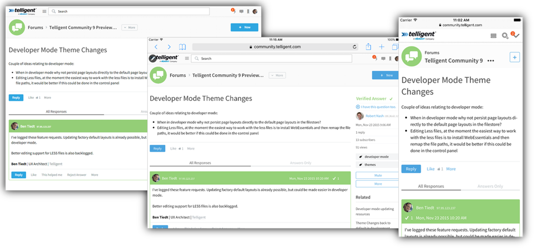
Responsive view of the same forum thread on a desktop browser, iPad, and iPhone.
For more information on using responsive options within the main web UI, see Widgets and Themes.

